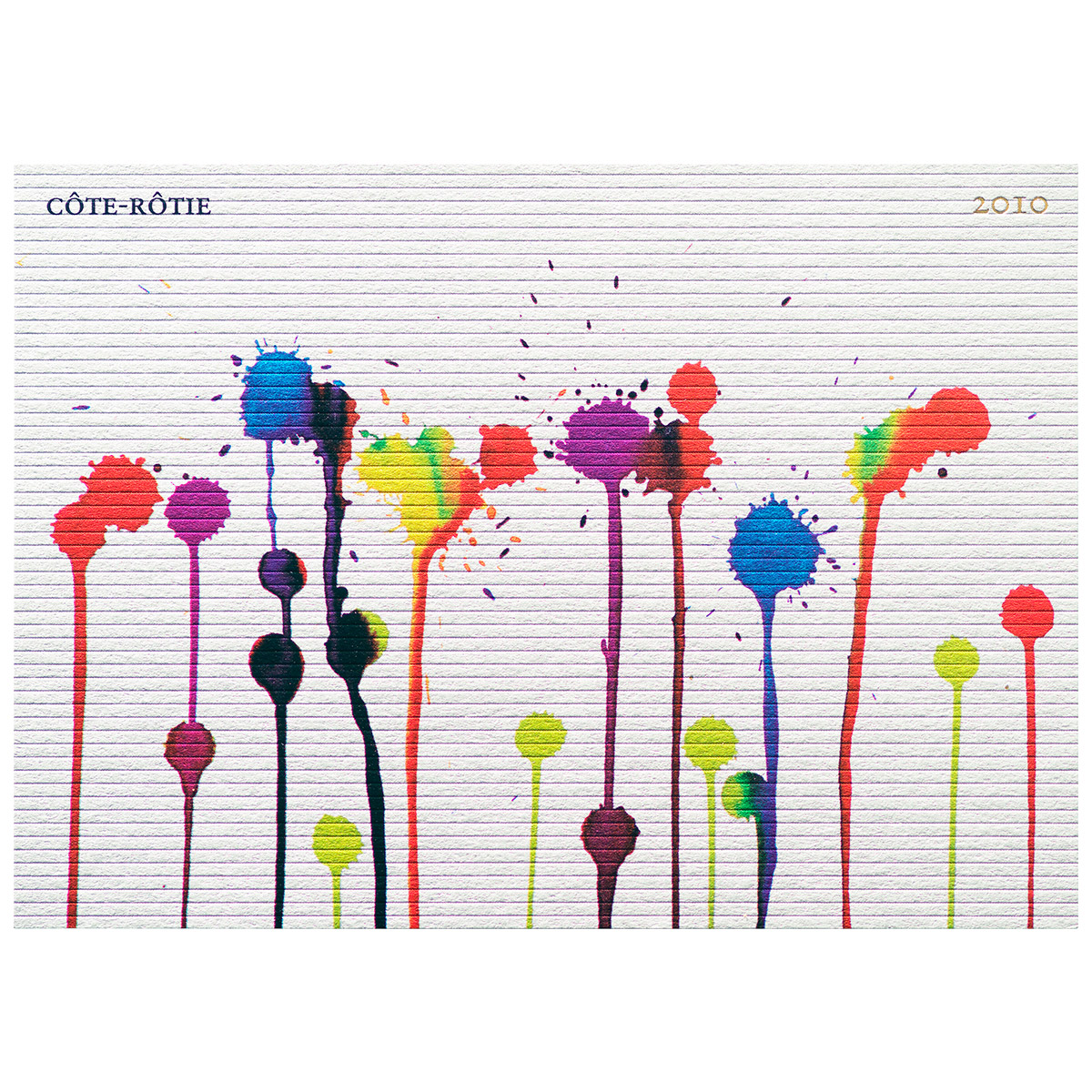
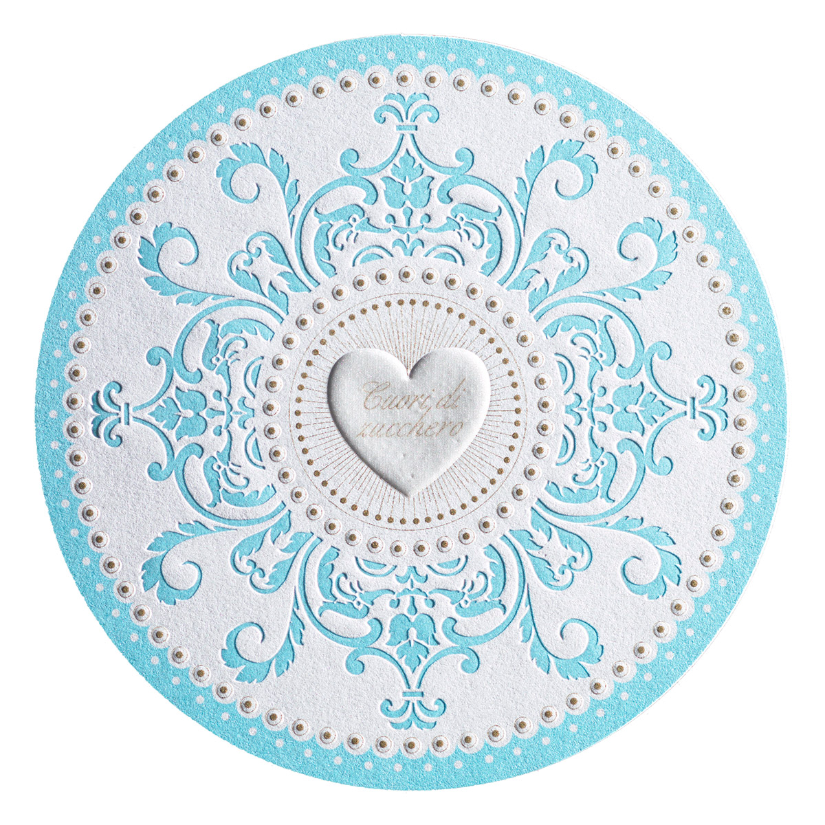
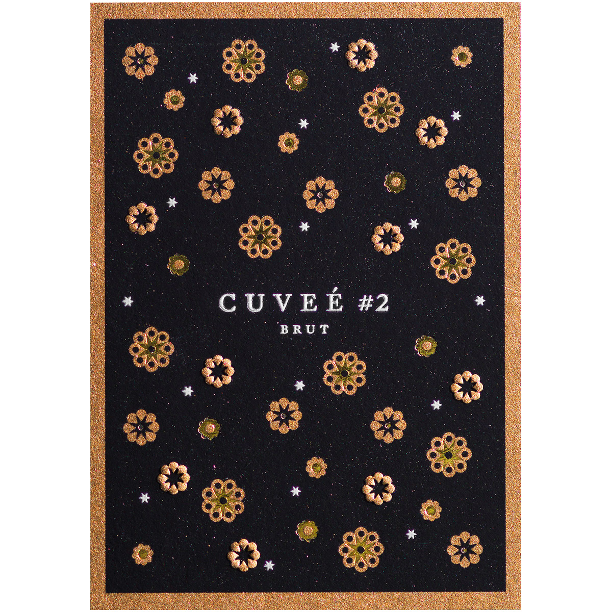
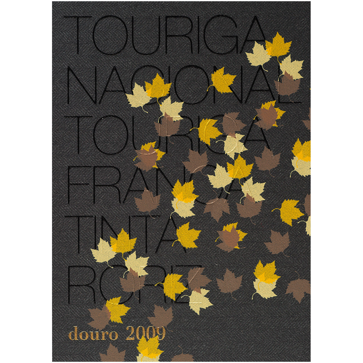
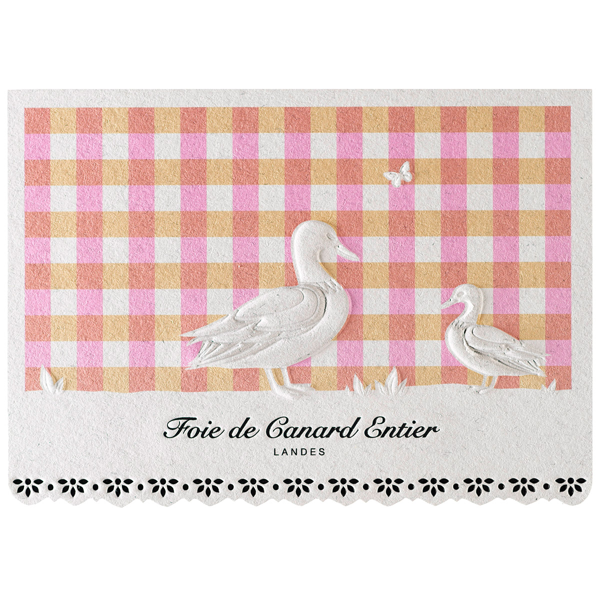
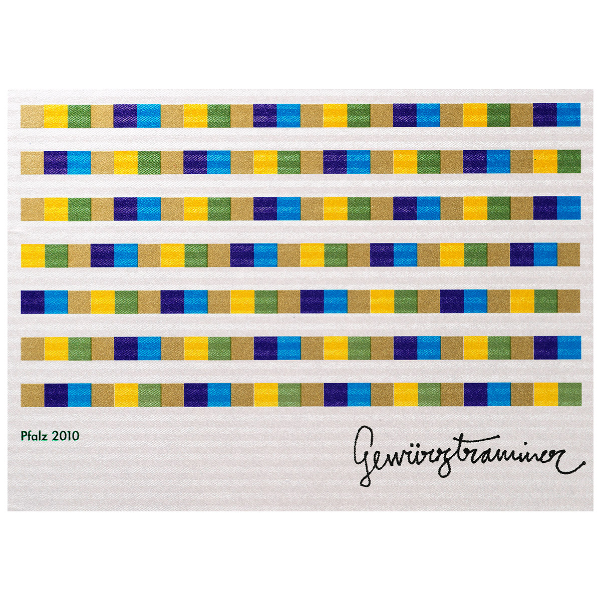
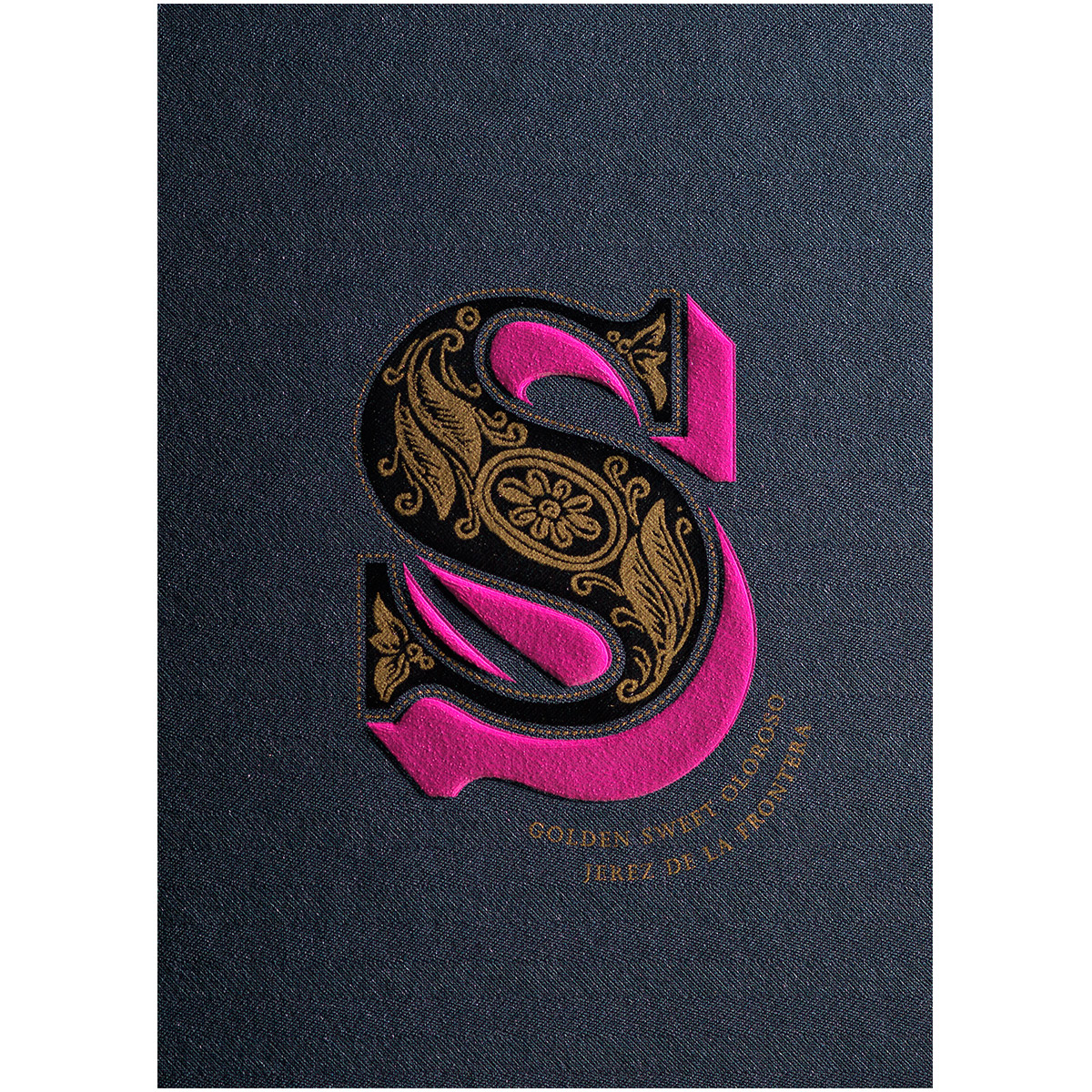
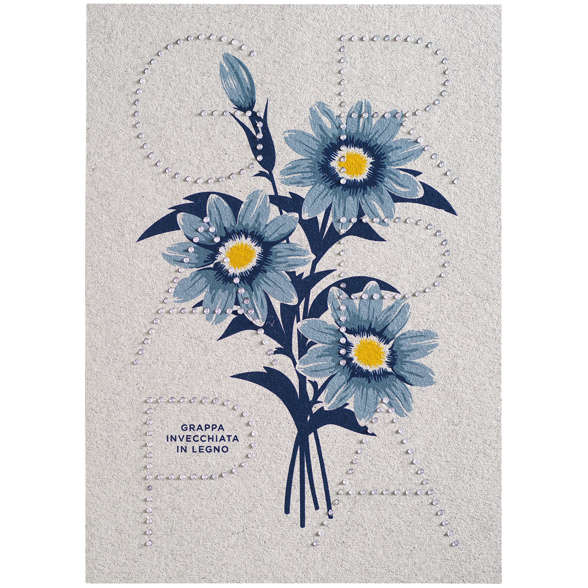
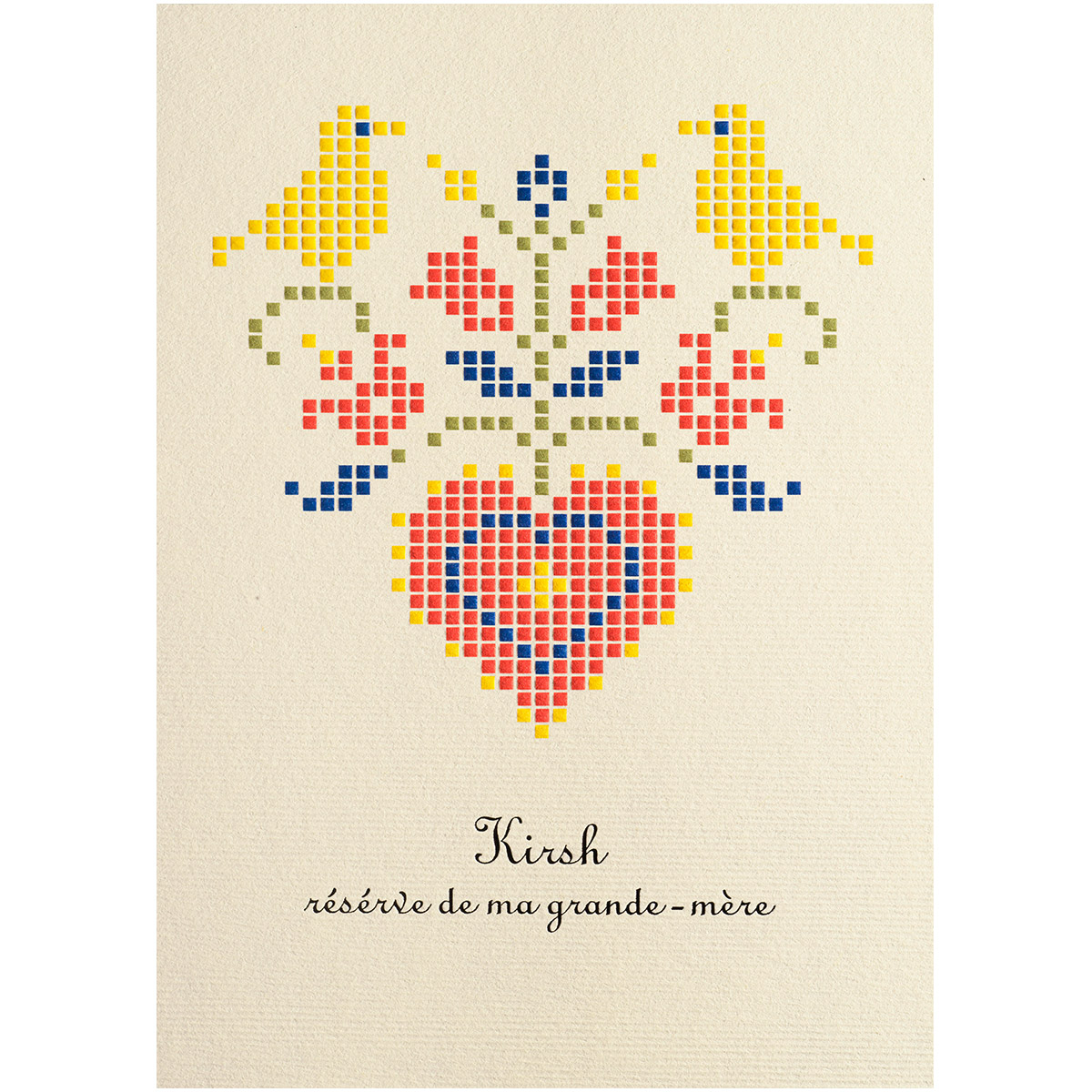
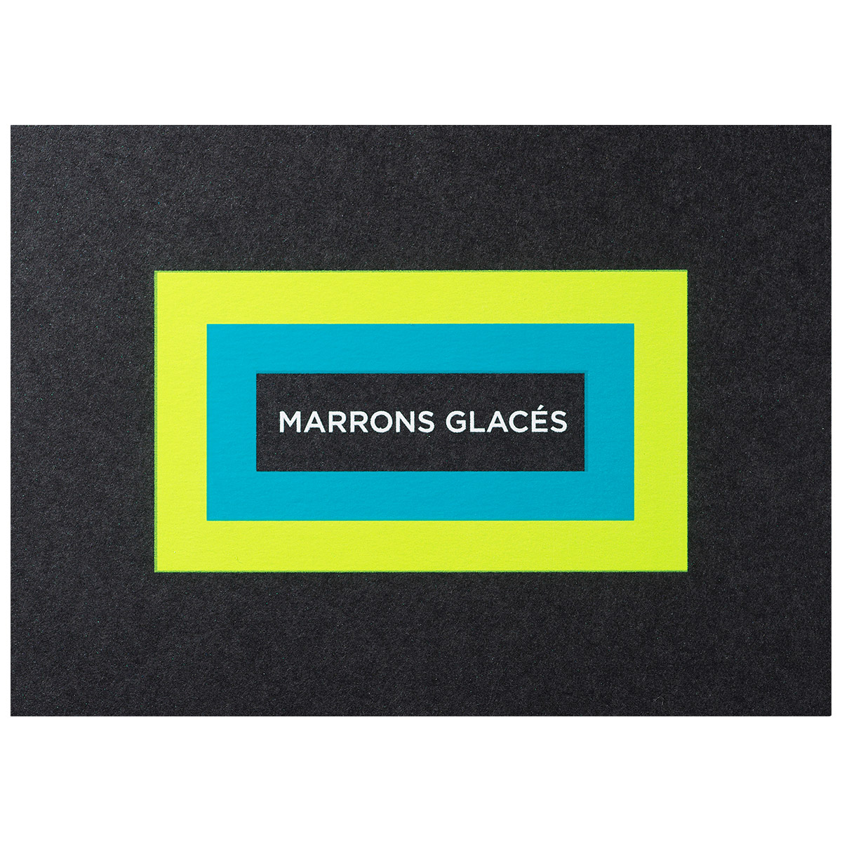
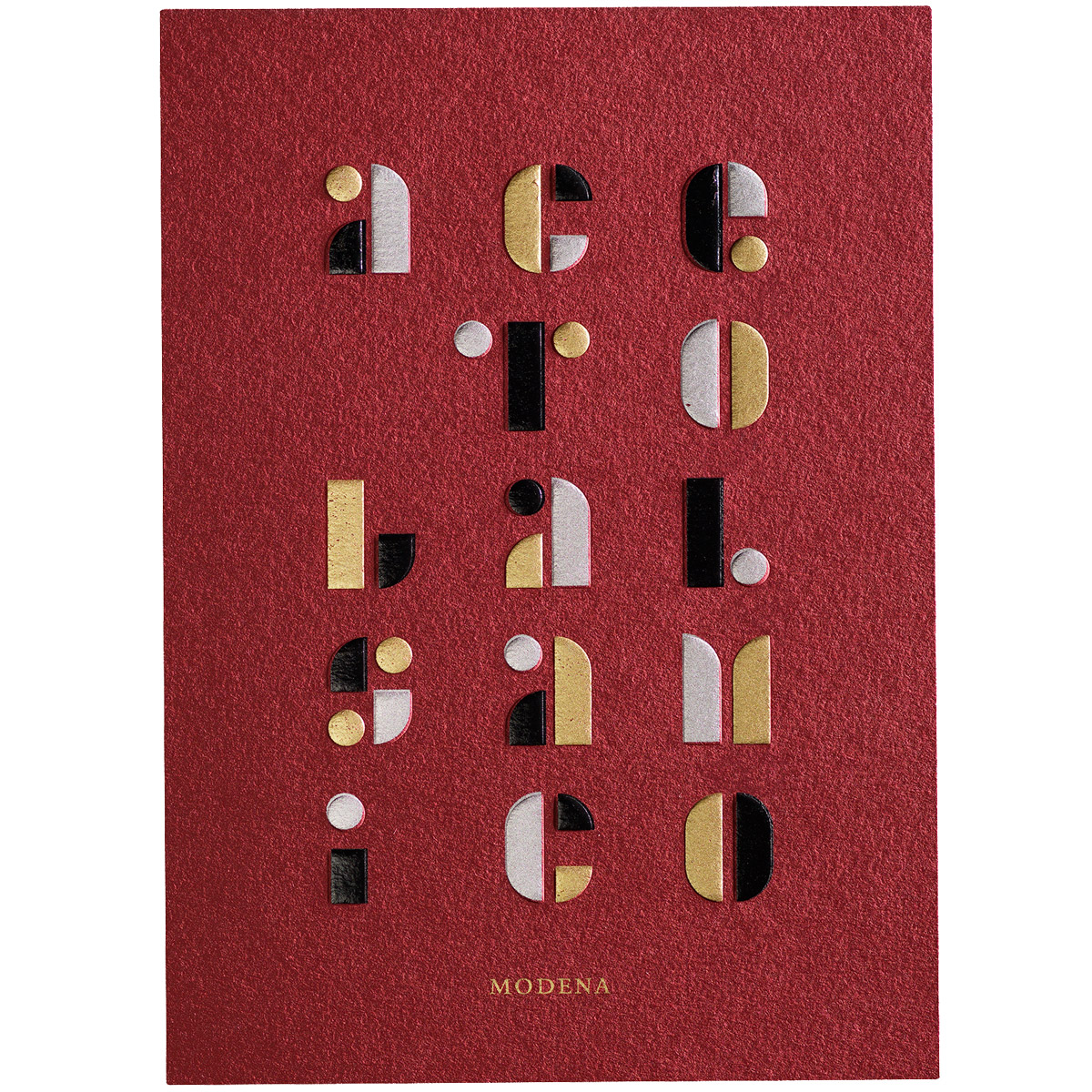
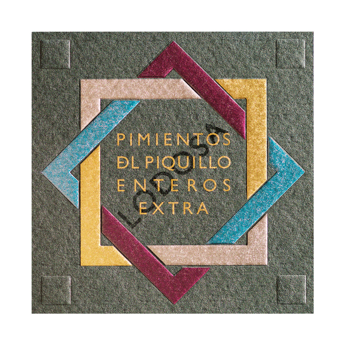
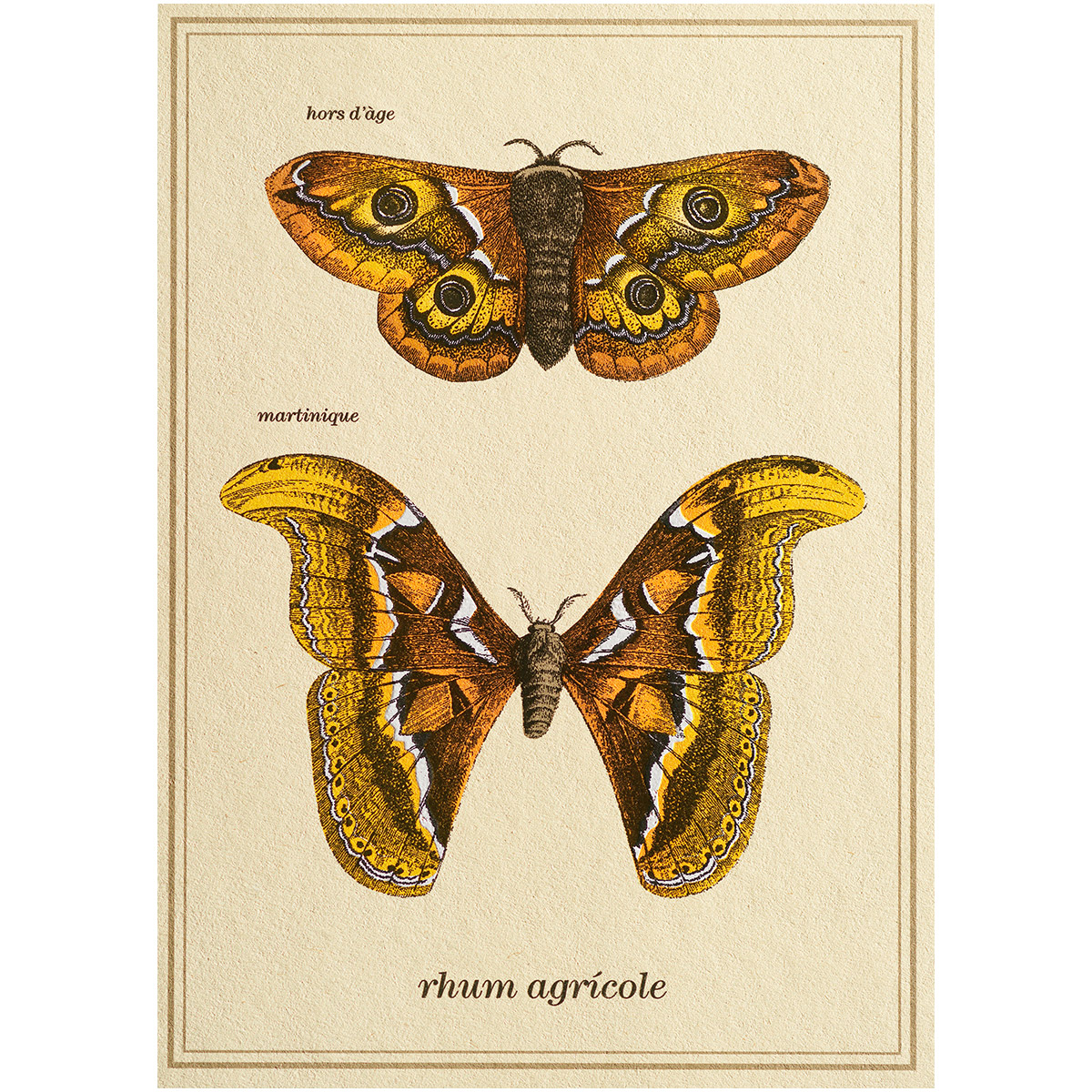
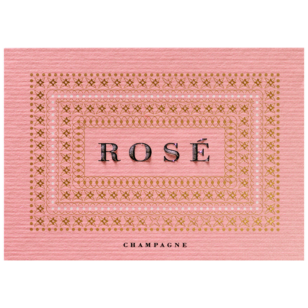
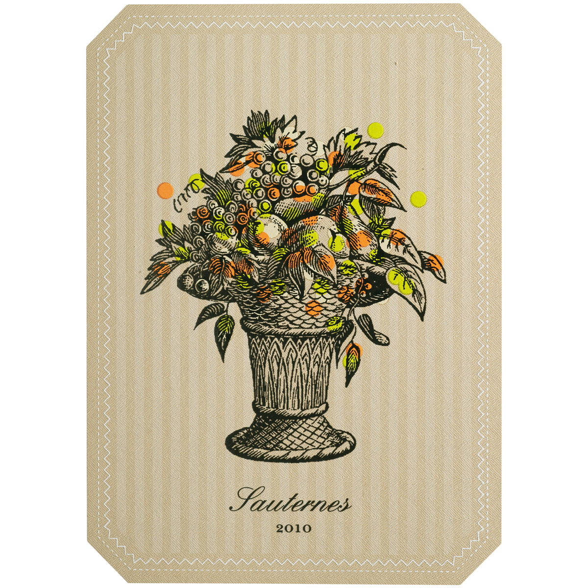
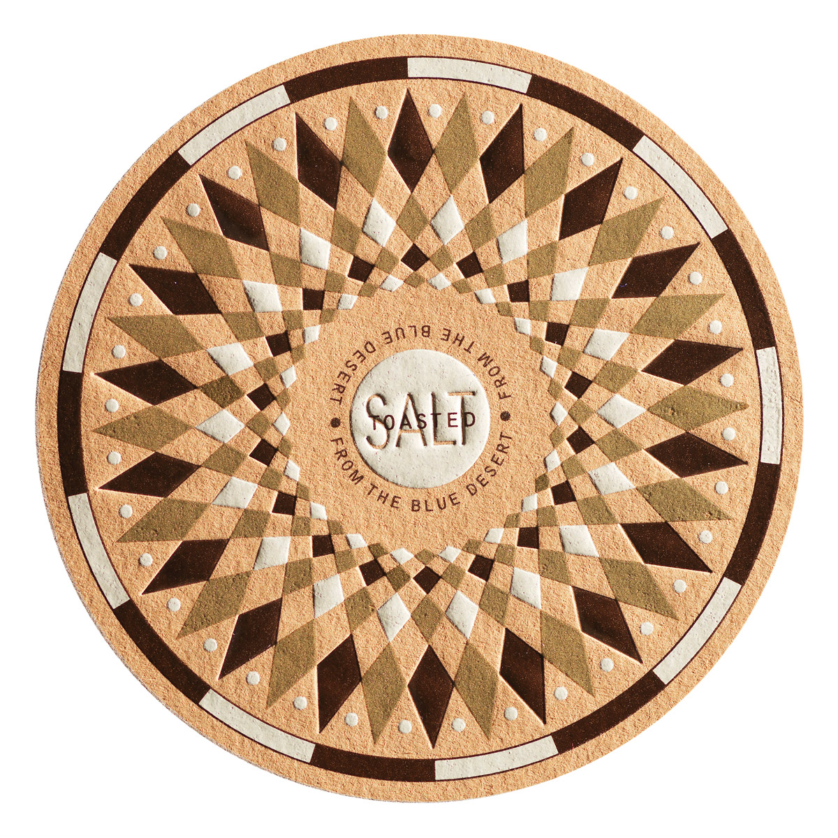
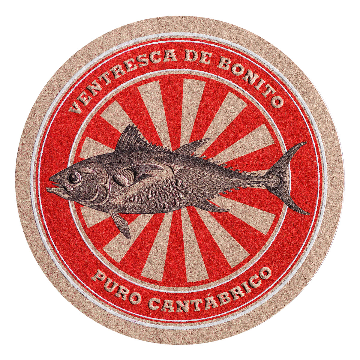
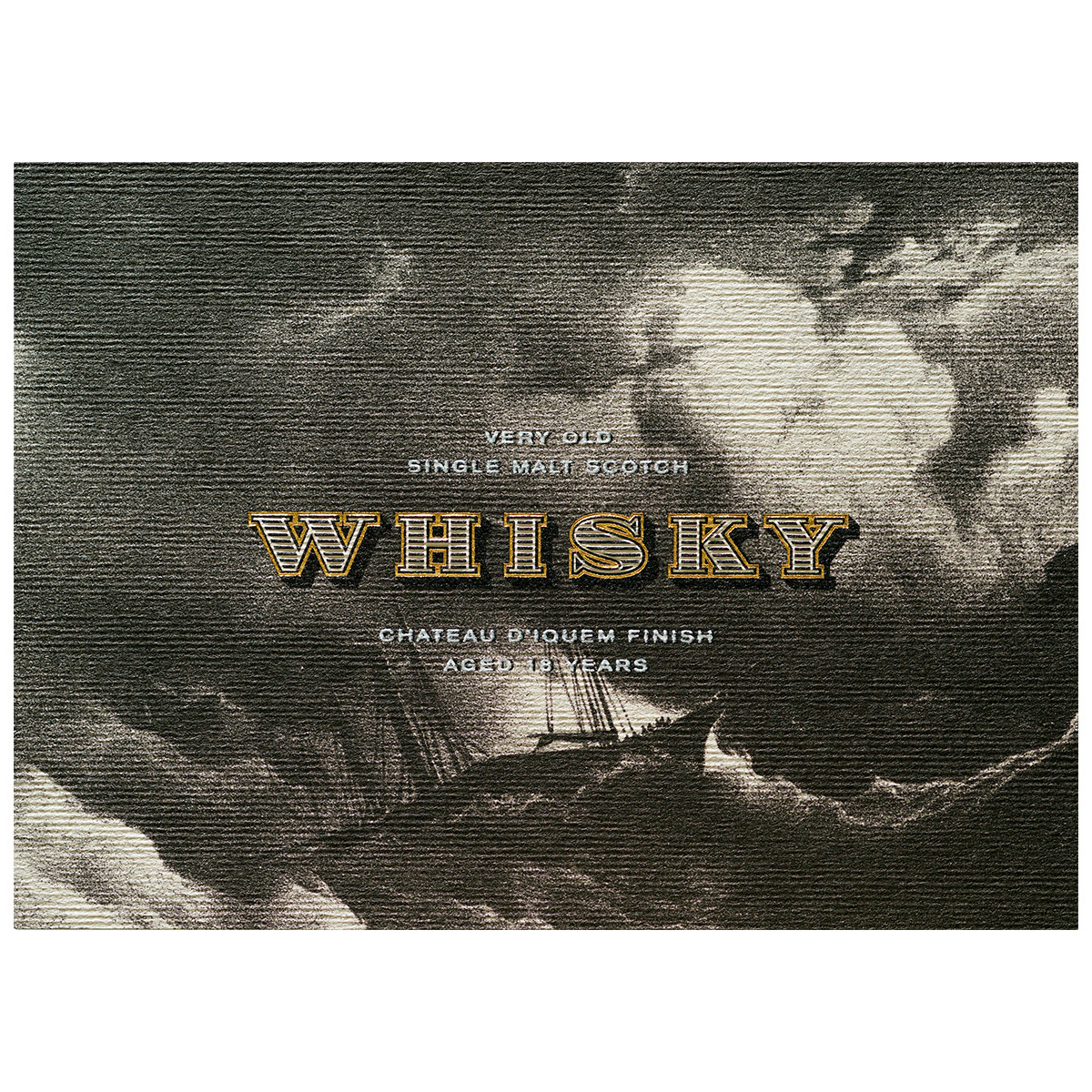
Each label is a particular form of conversation, an exchange of meanings and desires between the brand and the public that becomes something intangible and powerful when it works: a good memory. An effective label is rooted in a solid business project. It is part of a consistent strategy and its design appeals to knowledge and emotion.
Xavier Bas puts these ideas into play with special intensity in the Imaginative Colours project, under the Manter brand. This is an exceptional collection that encapsulates nearly 20 years of experience at the vanguard of graphic design applied to packaging, with recognisable work that has broken new ground for the language.
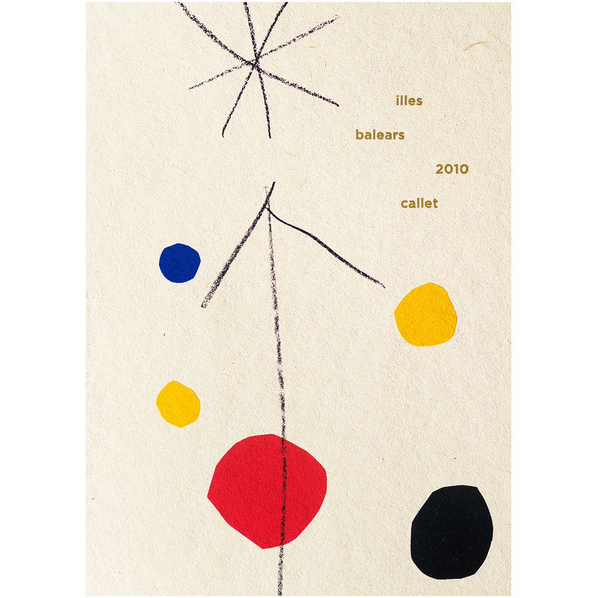
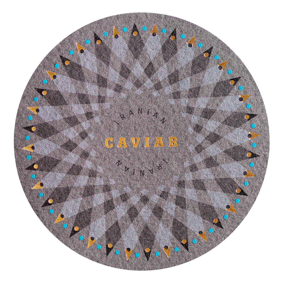
What is Imaginative Colours? A project that we developed in 2010 for the Manter paper company (currently Arconvert) aimed at demonstrating the potential of about 22 different types of paper, most of them in colour, for purposes of communication. What was new was how we tackled this aim from a comprehensive perspective both to strengthen the link between the physical support of a label (paper) and a product and to provide factual information to designers and printers.
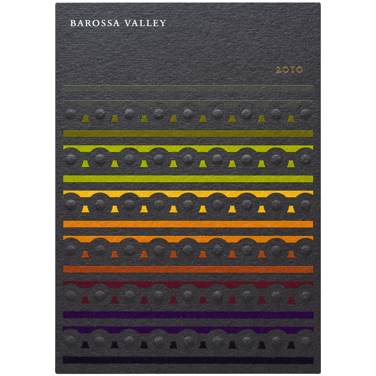
Are they real brands?No, they are fictional product labels. In fact, the first part of the design process consisted of relating each paper to a product in order to show the expressive potential of each case, something like discovering the identity of each paper. For example, the pearly Constellation Jade Pinstripe paper seemed more suitable for a champagne that for some other product and we thought the recycled Woodstock Betulla paper would be perfect for use with a wine from a small winery. Although every label is fictional, many people have asked us how long we have been working for clients in Australia or Italy, referring to the Barossa Valley and Aceto Balsamico labels. It must be remembered that this was the first time that a sample was presented under these terms.
What role did Vidal & Armadans play in the development of Imaginative Colours? They were key. In fact, when we took on this rather experimental project, we made it a requirement to do so only with Vidal & Armadans. We thought that their experience and availability would be crucial. And it was true. Once we began with the material, the printing house provided all the facilities to test, rectify and take decisions, which is essential to ensure that the design project does not end in the studio, but right with the machine.
Of what use is the project to a designer? One requirement that we set for ourselves was that the outcome of the project had to be a real guide for designing and printing on these papers that not only “dis-covered” the aforementioned potential for communication, but also technical aspects like printing and handling. Somehow we also wanted to make public everything that we had learned as designers during the process.
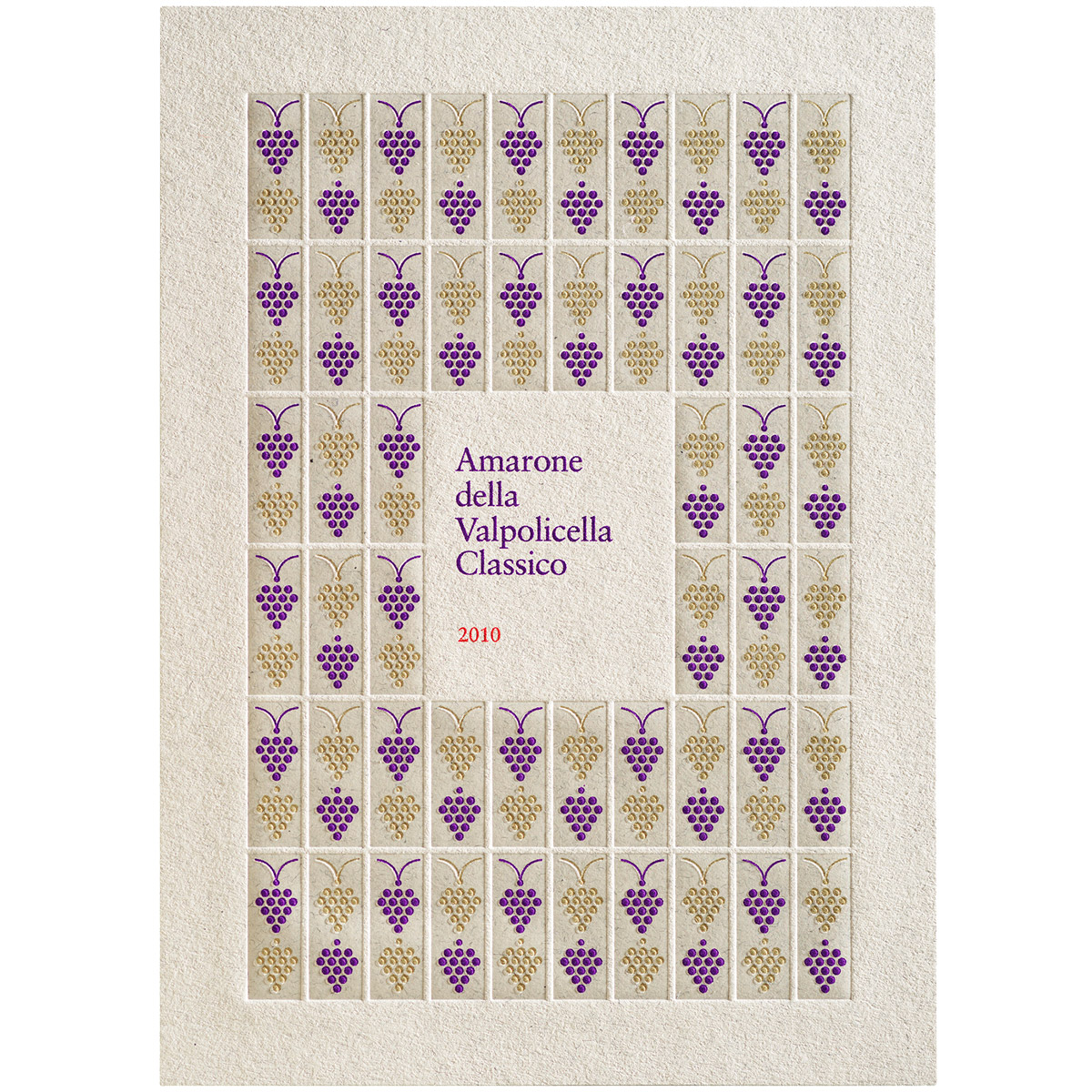
Which labels would you highlight from a technical perspective? They all have some effect that contributes to the visual and tactile impact. For example, the Amarone della Valpolicella label is stamped with a low-relief foil to achieve a very rich texture in which the grapes appear to move. With the Grappa label, we chose a stamping and Braille finish that had never been applied before. The Aceto label is also revealing, which combines metallic colours and relief. And for the Barossa Valley label, which was printed in nine spot colours on black Tintoretto Black Pepper paper, we had to apply an initial layer of white silkscreen onto which we could print the nine colours in offset by running it through the machine twice. It was a real challenge to achieve that!
In general, what do the effects of printing mean for how a brand is perceived? A tremendous leap in quality. By changing just the paper, the print or the relief, a brand changes, surprises and grows. I am sure that it works in terms of sales and don’t think that the great technological development of recent years would have happened otherwise.
What should a printing house provide? Technological solutions and an environment conducive for designers, who are the last ones responsible for any printing project, to direct it.
How is the higher cost of this type of printing justified? The most effective support of communication for wine and most food and drink products is the label, which justifies always searching for the best graphic and technical solutions to assist in expressing the brand. It is a mistake to view the costs of a label as if it were a simple material, because in reality it is a key part of marketing strategies.

