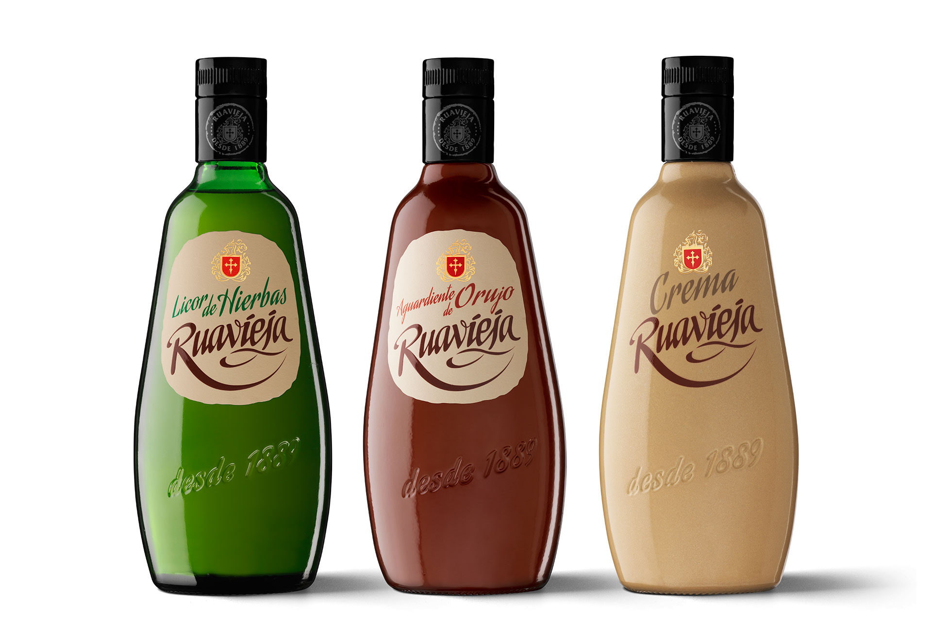
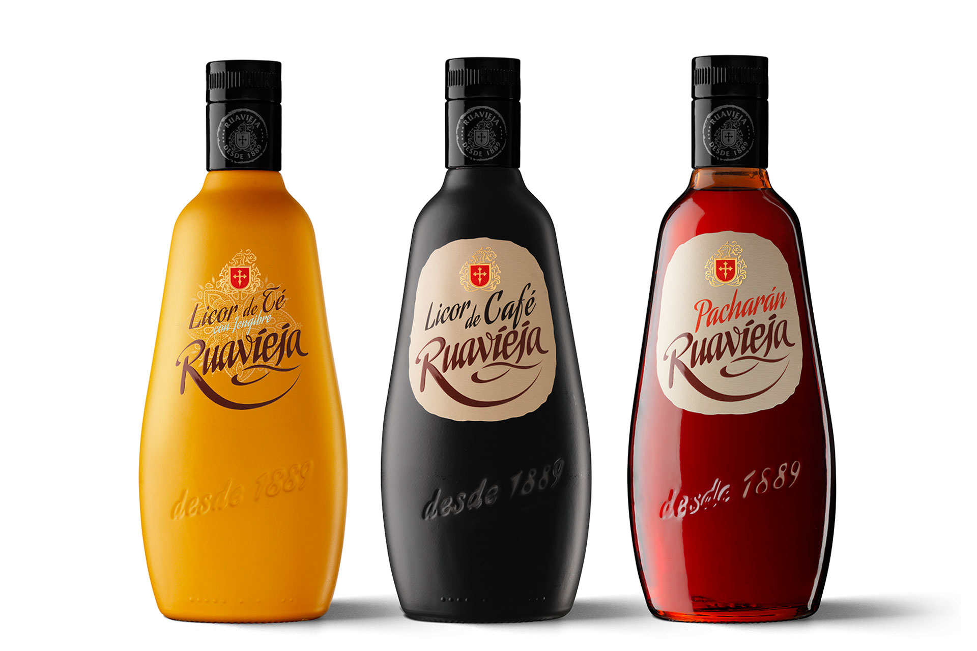
The history of the Ruavieja brand spans four generations of the Rodríguez Ovalle family from Galicia, which has succeeded in keeping up the true aguardenteira tradition, the time-honoured way of making pomace brandy.
How do you begin to redesign the label of an established and recognisable product? How do you maintain the bond with loyal customers yet at the same time update the image the brand projects? In short, how do you achieve a satisfactory balance between tradition and the dynamism of the market? Ruavieja is an enlightening case in point. Developed by the Barcelona-based Morillas Branding Agency, it exemplifies the transition from the origins of a mass-consumer brand to its contemporary expression, a subtle shift that in this instance relies on printing work that is as composed and natural as the creative aspect. The Morillas team talk about the main points of the process.
What does the new series of Ruavieja labels add? It represents and renews the emotional connection with consumers. It conveys a simple and straightforward way of doing things; it showcases the idea of ‘handmade’, the attention to detail and, above all, the brand’s natural quality and artisanal character.
Was it necessary? There’s a constant need to evaluate a brand’s position at every given moment. To understand how it can keep up its essential values and how it can project them. In the Ruavieja redesign project, we were looking to clarify and update while preserving consistency. The flagship of a very traditional sector and a leader in its segment, this aguardenteira company decided it was time to rebuild customer loyalty and to expand its market.
How was this achieved? Our proposal features a younger, more dynamic and affirmative design that is a perfect fit for the artisanal aspect that has always been a defining characteristic of Ruavieja. It is the result of combining a vibrant, modern tone with the brand’s most iconic and established visual traits: the typeface and the irregularly shaped label.
What was Vidal & Armadans’ role in this process? It was crucial, as they understood and captured the brand attributes in their materials to perfection. They were able to place technique at the service of a brand image and to solve initial technical difficulties, such as the Braille embossing or the formulation of the adhesive.
Morillas is an agency with a lot of experience. What is the consultancy’s view of today’s packaging, which is so diverse? Thanks to the facilities for creating an idea and bringing it to life, thanks to constant innovation and technology, there is an impressive world of opportunities opening up before us. And in many cases we are only just beginning to discover them. In this immensity in which anyone can create something, the fundamental keys to packaging will always be functionality and looks, the quality of the design and its usability, and of course the quality of the materials.
What are the factors you have to take into account when designing packaging for a mass-consumer brand? Is it all strictly predetermined or is there still room for innovation and creativity? There’s always some room, however small it might be. The strongest conditioning factors today are consumers, who have opinions and above all the means and outlets to make themselves heard. Their lifestyles are constantly changing. They want experiences and excitement and they know full well what is essential and unalterable, and what can be changed and improved.
What’s does the future hold in the realm of brand building and packaging design? Brands and packaging will both have to evolve in parallel with purchasing habits. We are shopping more and more on the internet, even for groceries. What does this mean for brand visibility and identity? That is the big challenge.


