- Techniques
- Full colour
- Relief
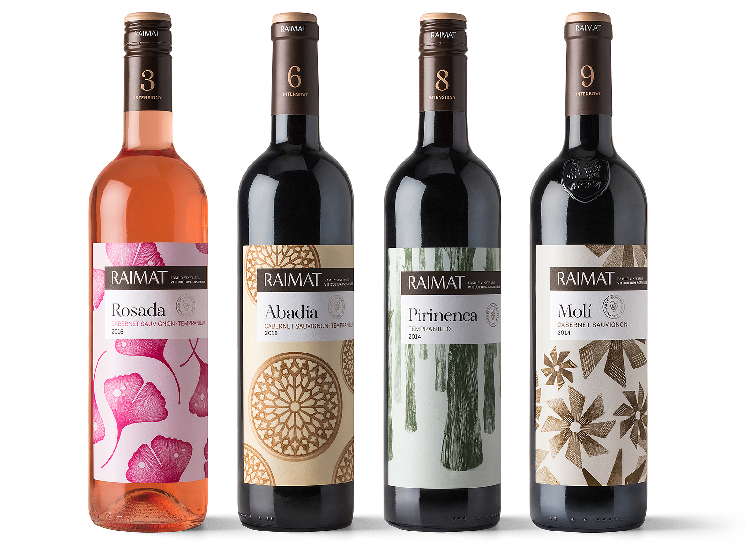
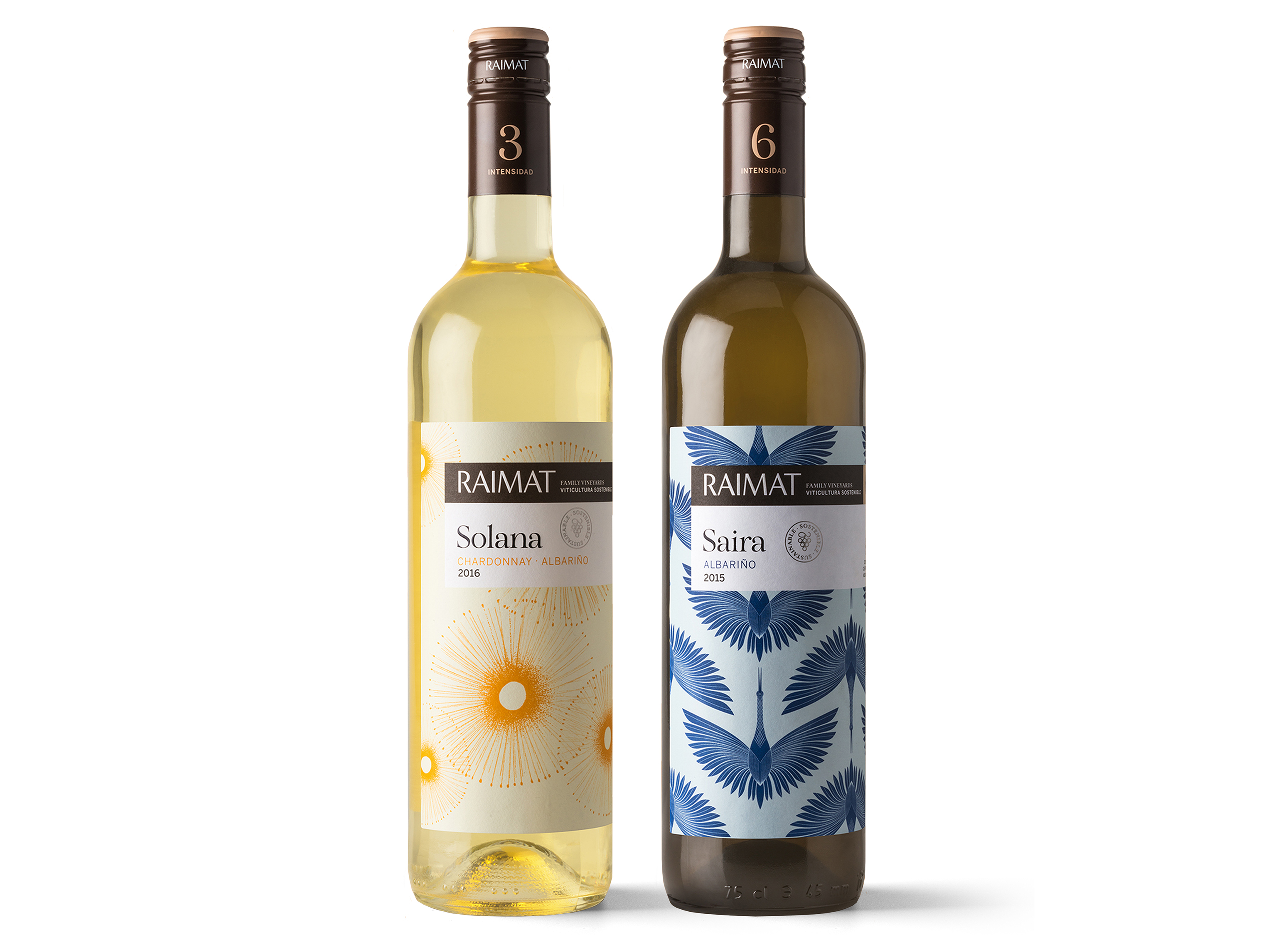
The new labels produced for Raimat, a famous winery from Lleida that is part of the Codorniu group, result from large-scale strategic change. The brand’s wines are becoming organic and are incorporating a new approach that provides greater informational depth in their presentation. To manage the identity of this new paradigm, the winery sought a studio with a global vision that was not necessarily an “expert” on communication in the wine sector.
Mucho took up the challenge and provided the distinguishing perspective that Raimat needed whilst striking a compulsory balance between tradition and innovation. Its most notable contributions include the graphic solution given to the wines’ new categorisation scheme, which is based on an idea proposed by Raimat’s advertising agency, La Fábrica de Sombreros: a numeric code that distinguishes the products in order to help consumers make their selection.
We could say that this collection expands the label’s traditional role. It is changing from a medium of identity and presentation to one that also has more of an informative role and even interacts with consumers. How did the idea arise to give such central visibility to aspects like the wine intensity scale and pairing suggestions? For us, all this rational information is of the utmost importance and we want to communicate it visually and usefully, grouped in an elongated background block of colour and ordered by size and hierarchical position.
We also redesigned the format. We did not want to split the information into two labels and chose a single body, which prompts you to rotate the bottle to discover all the content. But changing the format is never easy. We ran tests with the labelling machines to ensure the viability of the new solution and to maintain the labelling speed.
Working with different illustrators reveals the personality of each wine
Working with different illustrators reveals the personality of each wine
The feeling you get is that the visual motif here is limited to a decorative role, or at least is secondary to the informational concept. There must always be a balance between the rational and the emotional, but let us not forget that the emotional factor is the most powerful one when making purchasing decisions. In this series, the visual aspect is based on an illustration that combines with the naming to evoke the feelings of wine. This image encompasses the bottle as if it were a perfume.
Why did you decide to use an illustration pattern on each label? We needed a flexible code that could be adapted to all narratives proposed by the naming, the part that the agency Usted worked on. So for each wine, we sought out an iconic element that would work as a pattern. The colour range is related to the numbers: the lower numbers, which are for young wines, have brighter and more primary tones than the higher ones, which are more muted and sophisticated.
The only exception to the pattern was Castell. It is a wine with history whose customers are more loyal, so they asked us for a more classic illustration.
Who created the illustrations? To enhance each wine’s specific personality, we worked with three different illustrators: María Corte, Carla Cascales and Judit Maldonado.
Raimat and especially the historical brand Abadía have a very well established image. What demands, difficulties and challenges did you face in (re)designing their labels? There is always reluctance to change at first. The version that you see now is the third that we worked on and the process took one year. Sometimes that is good, since each time that we reworked it, the client dared to take another step forward. Besides, the market tests backed this development, especially the international ones.
What are the label’s features from a purely technical perspective? The format and few added effects stand out. We would have loved to have done without stampings and it would have been more consistent for a brand that is now organic.
You get the feeling that these labels look better on a bottle than they do when pressed flat. That’s not surprising. We obviously design with the curvature of the bottle in mind, so they work better when stuck to a bottle.
How did the printing process go? Perfectly. We wanted Vidal & Armadans to do the printing from the start, because they know how to listen and contribute. They also want to print all the labels that we design.


