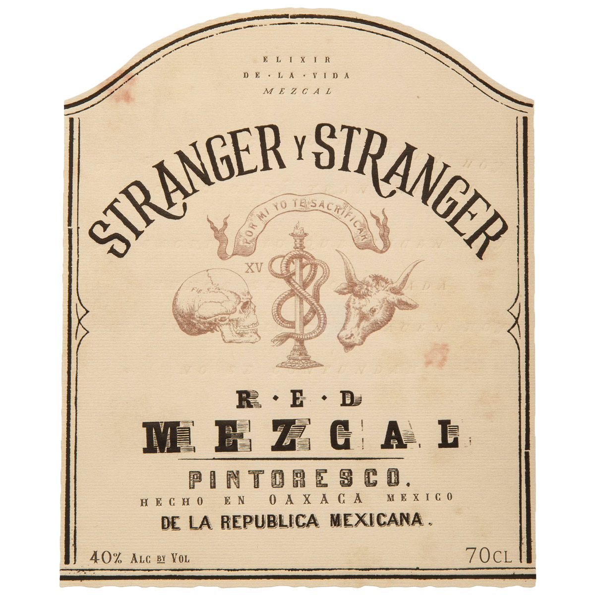
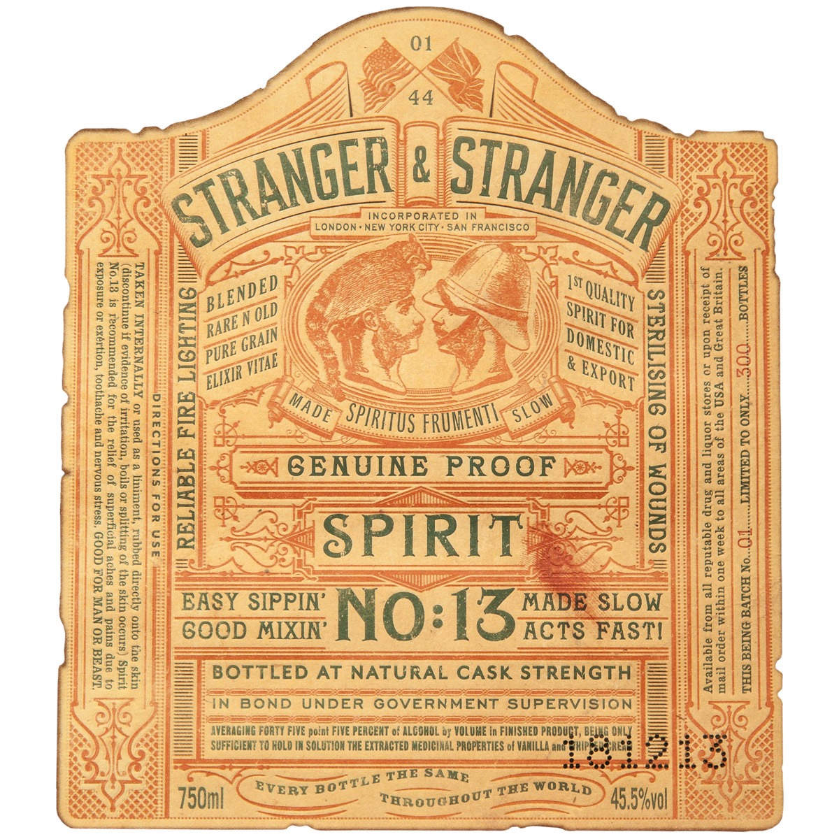
The secret of a good brand is to tell a compelling story, and this is where wine label design often fails, says Kevin Shaw, the founder of Stranger & Stranger. To change this, the winemaking sector can learn a lot from the liquor industry, where a greater “spirit of adventure” is appreciated. Whether begun or suggested in packaging, this adventure is what brings value to the product.
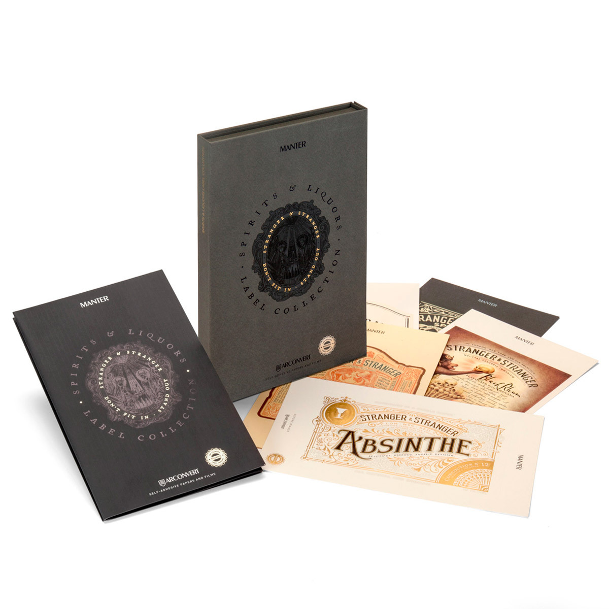
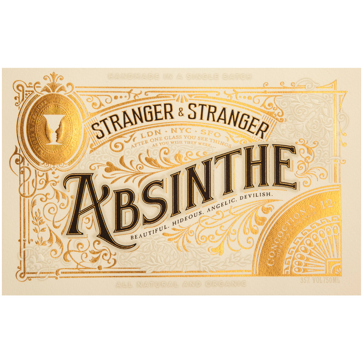
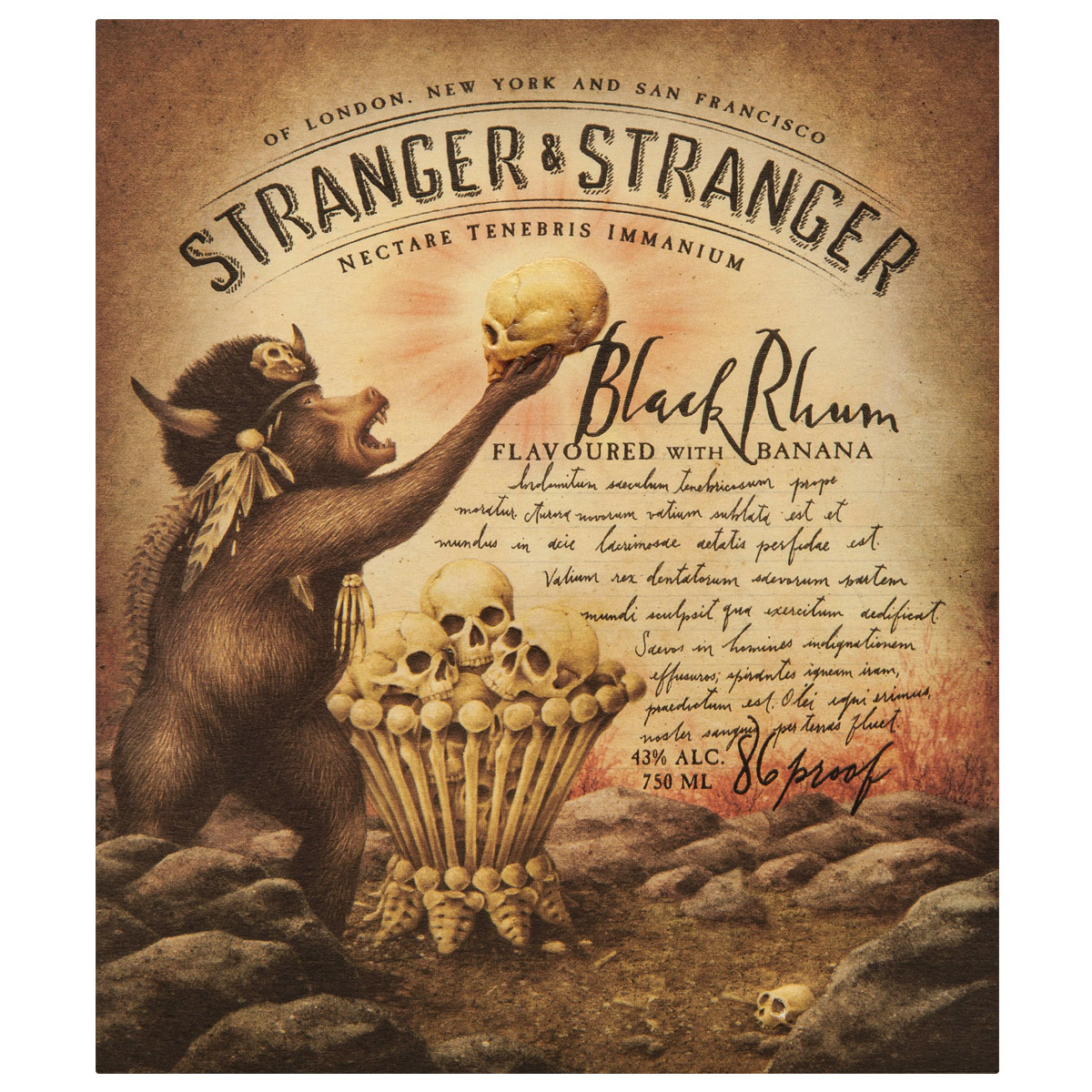
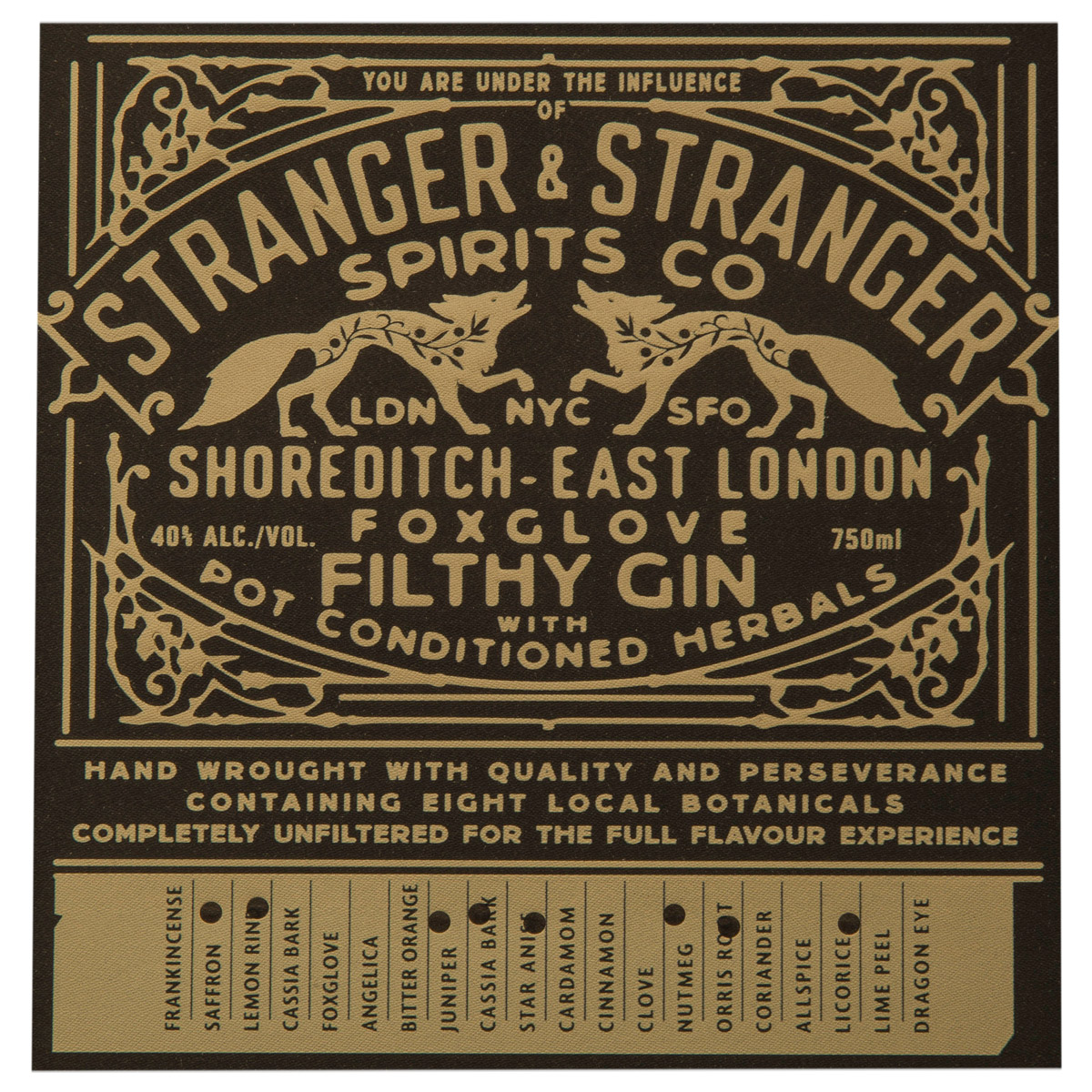
The labels of this exceptional project for Arconvert may be considered gateways for narratives as uncharted as they are suggestive. Supported by design and an overwhelming finish and printing, they are the first pages of a storyline conceived for the consumer to unravel, fantasise and enjoy.
What does the collection consist of? Arconvert Spirits & Liquors Label Collection is a series of fictional labels, a sample of different technical applications and especially a large source of inspiration for graphic designers. Before Arconvert offered us the project, we had already developed a series of concepts for packaging liquors with our own brand, Stranger & Stranger, so we thought it would be ideal to work on them on these papers, trying out different finishes during printing.
What relationship did you establish with the client, the paper company Arconvert, and with Vidal & Armadans? It was an extraordinary experience. The Arconvert team was completely open to our ideas and regarding Vidal & Armadans, we can safely say that it is one of the best and most attentive printing houses that we have ever worked with. They are boutique printers whose attention to detail is unsurpassed. Never before had we witnessed engraving plates filled manually to achieve the most perfect result possible!
What is the difference between designing wine labels and liquor labels? It is a matter of narrative complexity and depth. Usually, there is a lot of strategy and planning in projects for spirits and liquors. There is also more work done on the storyline, thereby helping to position the product better and increase its sales.
Where is label design headed? The aim of any client is obviously to get people to grab their bottle from the shelf and buy it. That should be the designer’s aim as well. We try to innovate all the time and we are obsessed with getting that innovation to work. And this is not only about labelling, but the entire packaging and, above all, the narrative force of the concept.

