- Techniques
- Full colour
- Relief
- Stamping
Effectivepackaging is that which projects innovative meanings, that which challenges market perceptions, that which gives meaning to the investment made and that which, at the end of the process,incorporatesrich, complex and meaningful technical production. All this for Lateral Branding implies a leap or jump that involves the client, studio and printing press.
Synchronising the movements, expectations and values of these three parties leads to the result obtained by this project for the UPM Raflatac paper mill: powerful concepts produced in an exceptional manner.
Francesc Bofill and David Santamaria explain the main key points of this daily acrobatic feat that is packaging design.
Howwould you define the working philosophy of Lateral Branding? One aspect we adopt as a studio that essentially designs product packaging is that we cannot afford the absolute freedom of an artist. Although an individual commissioning a project from us looks to us for creative value, our work is always limited by one key condition: a return on the client’s investment. Some may find this overly prosaic, but that is how we view it.
Do you see it as a specific feature of packaging design? Absolutely, because the economic impact of effective packaging is enormous. But the paradox is that this conditioned freedom is what leads to the creative challenge that spurs us on. It is like a high jump: a jump that is too easy neither motivates you nor has any interest for anyone. It could be said that you first have to have your feet planted firmly on the ground to be able to jump high later, as high as possible. A truly good packaging design doesn’t just jump the bar; it has to clear it by a lot.
Do you also seek this philosophy in the graphic arts industry? Of course. We can’t fail at the end of the process. We believe we fully share this with Vidal & Armadans. This is the why we understand each otherso well and enjoy debating and finding solutions to ideas that not everyone is able to solve.
How did the project arise? UPM Raflatac is the labelling division of a large Finnish paper company. Its Prototype range incorporates innovations in new self-adhesive materials, so we thought that thebest way to promote it at the last Labelexpo Europe trade fair was with labels that simulate real products.
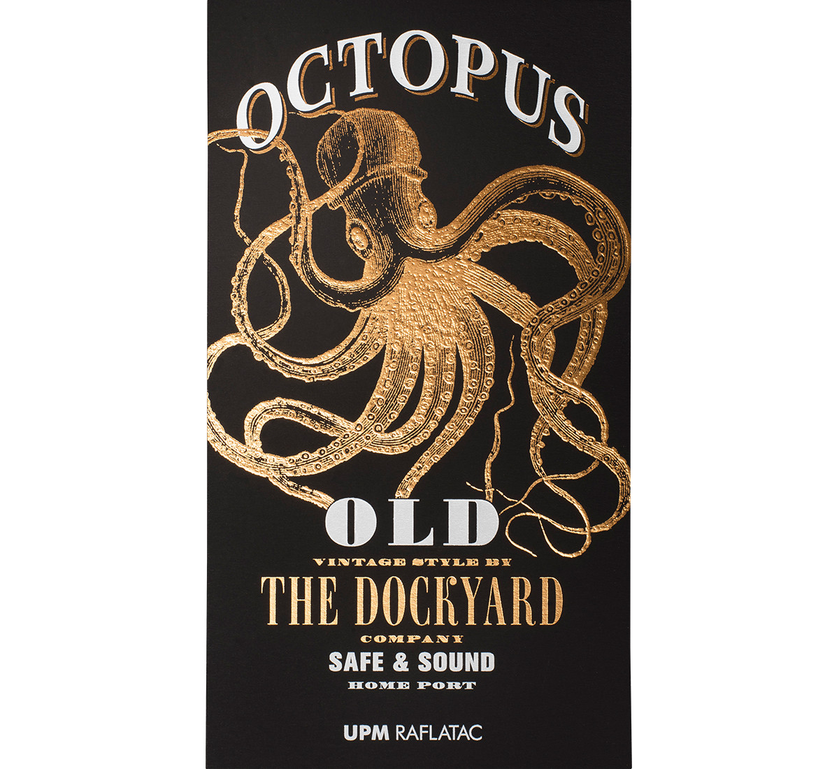
Octopus, an ale with a seafaring feel
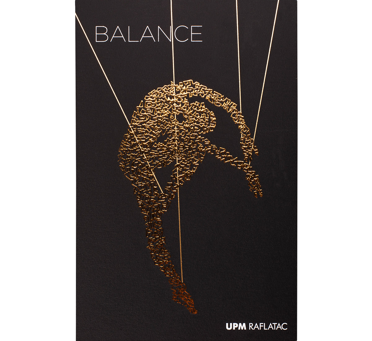
Balance, a sweet white wine
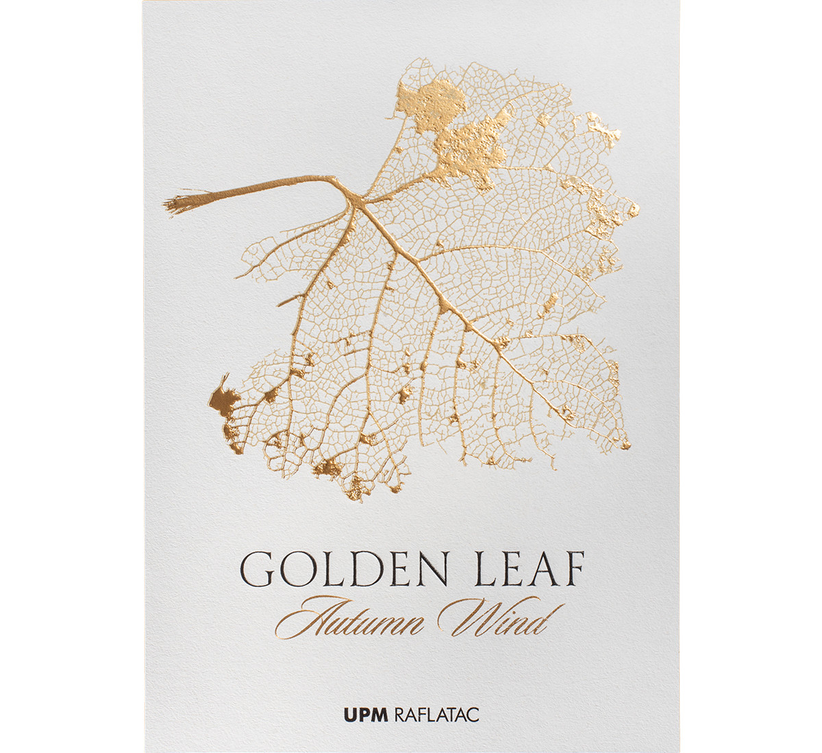
Golden Leaf, a wine with a contemporary flair
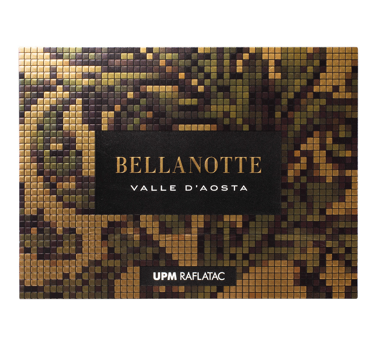
Bellanotte, an Italian spumante
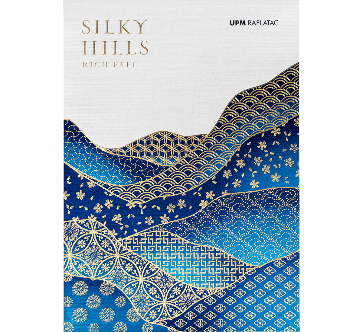
Silky Hills, a Japanese rice liquor
How was this developed? The client gave us free reign to define the conceptual, creative and technical framework of each label. For each material, we decided if we were going to make a label for a rum, wine, water, etc. and we then provided a suitable brand name and concept for each. Finally, we suggested the production graphics and finishes.
So you enjoyed an unusual creative freedom. We did, although we set ourselves two principles to follow in all the designs. The first was to achieve a premium image. It makes sense, because if you decide to use added value materials that are more expensive, you do so when you design product labels that can support these without any problems, with a positioning that demands expressing value and distinctiveness. The second need was to attract the interest of both designers and brand managers, marketing people, the people who evaluate the proposal of a specific labelling material and its supporters. The idea of simulating labels as if they were real products reflected a professional challenge that was very specific to their field: creating brand value.
Did you have to go very far in the simulation? Creating the perception of a premium brand involves constructing a brand narrative that reaches the public, no matter how many things you invent. Suggesting an attractive concept that has to provide a strong visual solution in terms of design and production quality. We have done what we do when working on a real product.
How many labels have been designed and printed? The project began with the design of seven labels that can be reproduced on a wider range of Prototype materials and this will gradually expand and change. The features and finishing possibilities of each material have guided the allocation of concept and design for each product. The seven pieces specifically correspond to a Martinique rum, a Portuguese mineral water, an ale with a seafaring feel, a Japanese rice liquor, a wine with a contemporary flair, an Italian spumante and a sweet white wine.
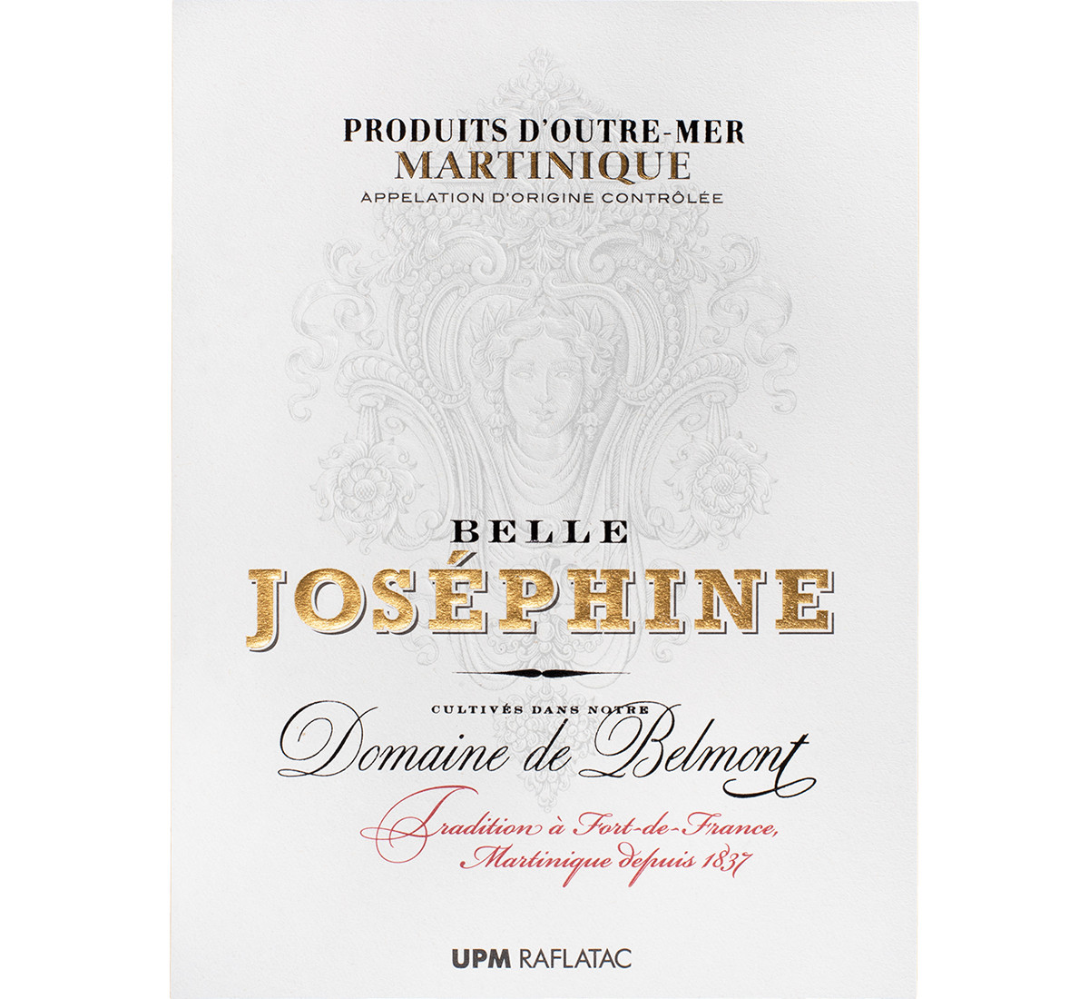
Joséphine, a Martinique rum
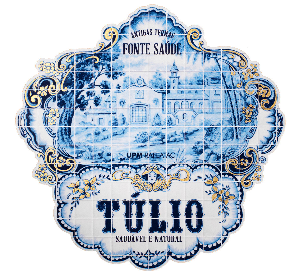
Túlio, a Portuguese mineral water
Can you explain a few cases? For example, with Túlio we are showcasing a crucial value of the natural mineral water market: quality and prestige usually depend on the source. It all began with spa culture, going to partake in the waters of places that were known to be especially healthy. From there, they go on to being bottled and there you have it: a market.
In the case of rum, it is very common to reflect the visual imagery of a Caribbean or tropical source. We decided on a refined Empire style aesthetic in order to avoid this and achieve the perception of a much more prestigious rum. The connection to the source is the name chosen for the rum: Joséphine, Napoleon’s wife, the daughter of landowners on the French island of Martinique who had large sugar cane plantations. If Napoleon has a cognac, why shouldn’t the Empress deserve a fine rum?
What about the technical aspect? As we do in many projects, we get the sector involved in the initial and intermediate stages in order to ensure that it can be technically achieved within the planned budget, as well as to take advantage of the contributions that a sector agent can introduce. If this figure is only included at the end of the process, you cannot make the most of the abilities of all the agents involved.
We were therefore able to count on the advice of a specialised, expert team. In line with this analogy, we not only had to clear the bar here, we also had to do a triple jump. UPM Raflatac did this by providing us with some outstanding materials, Lateral by developing the image of several prestigious products, and Vidal & Armadans by supplying the technical resources and knowhow to complete a project in which all the members worked hard to achieve the success obtained by the client.

