- Client
- Entrecanales Domecq e Hijos
- Techniques
- Braille
- Embossing
- Full colour
- Spot colour Offset
- Stamping
Pablo Guerrero compares his work to a well-known concept from the wine world: act like yeast. A lovely metaphor: yeast ferments existing brand ingredients to transform and elevate them, resulting in a more unique and appealing expression full of nuances. In other words, work is the protagonist. And there is always a lot of listening behind it all, a lot of process and a lot of care. An entire philosophy that permeates the example we see here: the label for El Aeronauta.
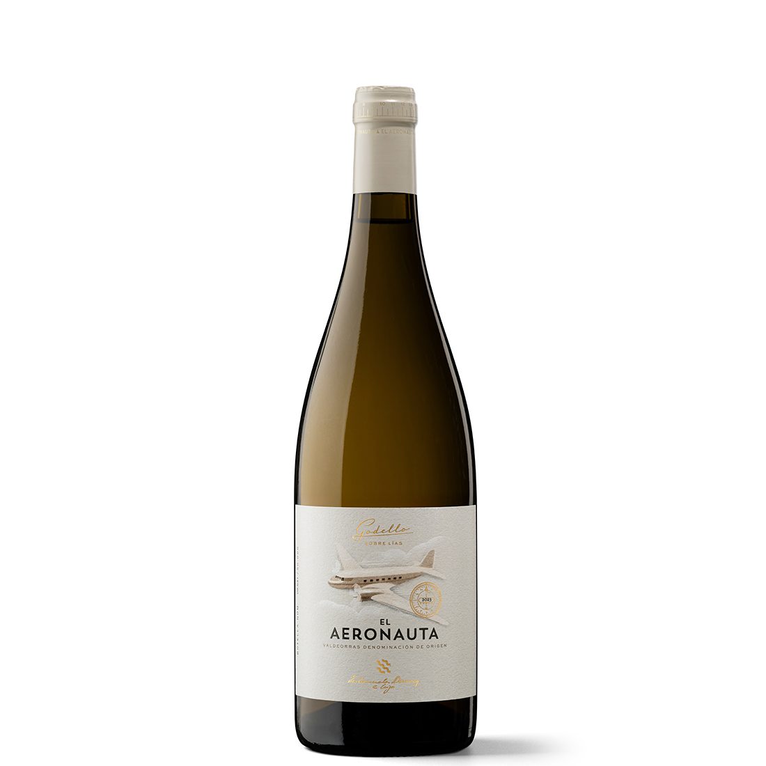
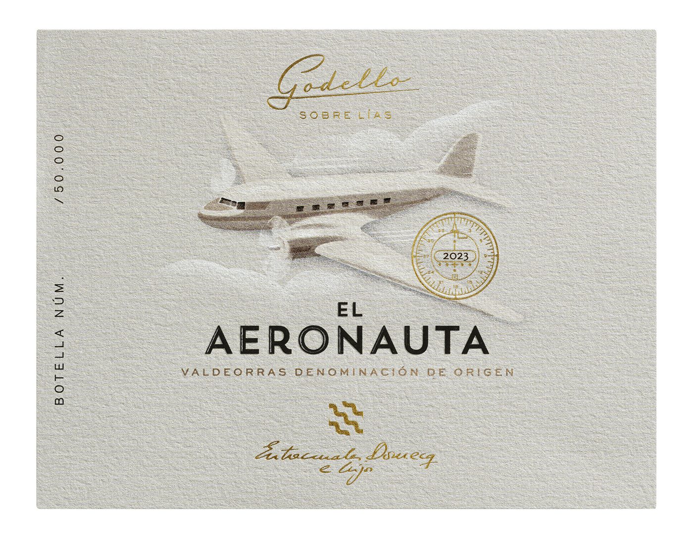
What does this truly evocative label tell us? A very Galician story of someone leaving his or her homeland to become a pilot, returning many years later driven by their love for the vineyards of their childhood. Its main motif, the legendary Douglas DC-3 aeroplane, symbolises this adventurous and glamorous world of classic aviation. It pays homage to a real-life aviator and later winemaker, Fernando González, but above all it hooks you into an engaging concept that evokes a kind of aeronautical Ulysses to the tune of Frank Sinatra. We were able to use this concept as a thread to build the brand and its communication.
What narrative elements does it have? A visual tone that imagines the world of aviation in the 1940s and 1950s, using period fonts and iconography typical of classic aeronautics, including small nods to old aircraft devices; for example, a detail of the plane’s visors on the capsule. It all recreates a historical era, transporting you to a nostalgic, cinematic adventure with the aroma of a great journey, when travelling was a unique experience.
Who did the illustration? It’s by Pablo Pino, a designer and illustrator who worked in my studio. He perfectly captured the DC-3 icon, rendering it in an earthy tone that evokes the minerals from the wine’s Valdeorras origins, with a grainy texture that recalls the visual style of a vintage film.
What is the label like technically? It’s printed on white paper, which was tinted to leave a reservoir where the clouds are. In other words, the clouds themselves are not tinted; they are the negative space, the hollow through which the paper breathes. There is not much else: a gold foil stamp with the phrase ‘Godello sobre lías’ (Godello on lees) and the stability meter symbol. Finally, the wine’s name is finished with a glossy embossed varnish.
How would you define your design, style and identity? I think this El Aeronauta example expresses it very well. Firstly, we like wine and we like design. We understand wine, and we enjoy it when we’re allowed to work, and I think that shows. Secondly, we try to tell stories. Let the label inspire a great story.
How many of you are there ‘fermenting’ in Pablo Guerrero’s studio? There are four of us: three graphic designers and a person for administration, management and clients. We have many small clients who allow us to do what we believe in. Sometimes with very low budgets, which is why we fight to secure commissions with higher budgets that at the same time allow us to maintain our freedom and ferment interesting things. I think that’s what we’re all striving for: to do good work that we enjoy.
What kind of projects attract you? There’s always a dichotomy in wine packaging: either we do something very French, very Burgundian, very terroir-based, with its script and copperplate lettering… or we do the opposite, something very colourful and commercial. I think there are thousands of territories and paths in between that can be worked on without falling into either of those extremes. That’s where El Aeronauta comes in.
In other words, there are areas to explore, stories to tell beyond the commonplace.
El Aeronauta is a wine label that doesn’t address wine. Rather than addressing classic wine themes such as territory or production, it positions the product in a different place with fresh, evocative connotations, thinking about the target audience’s desire: the illusion of a good story told with attractive components.
How can clichés be avoided? The first thing is to recreate classic wine codes, although introducing hints of irony, unexpected touches. There’s a Stranger&Stranger anecdote that recounts the process of creating a whisky label: they moved into the distillery and spent a few days observing everything that happened there. Then they designed the label to resemble a small theatre stage where many things were happening. For example, it shows a cat licking a puddle of whisky. It’s about visualising the unexpected, breaking away from the norm.
Whoever wants to see something classic, fine. But if we introduce a distinctive and groundbreaking touch, it will provide a good hook with which to tell a story. This involves taking the time to think, asking questions, exploring possibilities and discovering alternative narratives that resonate with you. Wine is very self-referential and sometimes seems to be examining its consumers. The key for us is to anticipate the experience you’ll discover when opening a bottle.


