- Techniques
- Debossing
- Estampación
- Spot colour Offset
- Stamping
- Tintas directas
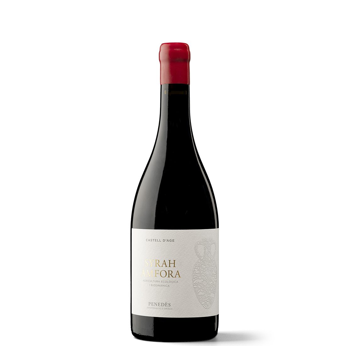
Elegance and quality, femininity and caring for the natural environment: these are the values shared by all the wines produced by Castell d’Age, a Penedès winery that pulsates with the savoir faire of three generations of women. When Gaëlle Alemany was tasked with designing the Syrah Àmfora label, she drew inspiration from the brand’s philosophy. In this case, the philosophy was suggestively shaped by the winemaking method itself: the venerable ceramic amphora, which is once again at the forefront today precisely because it allows the nature of the wine to be expressed subtly and purely.
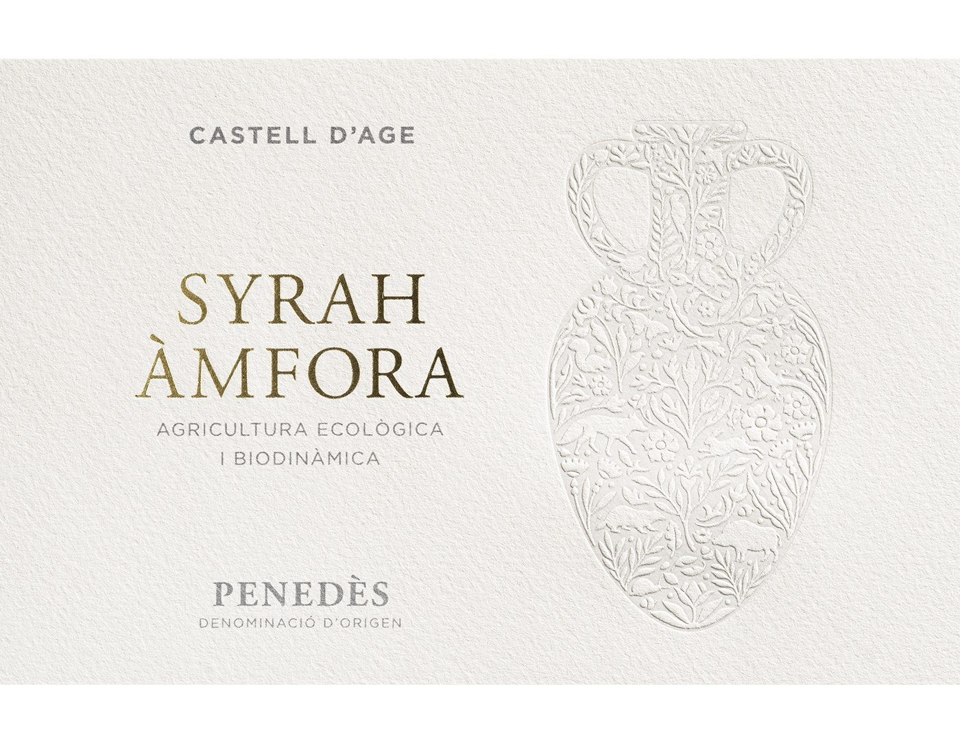
Why did you decide to hint at the amphora rather than showing it explicitly? It’s the power of evocation. I thought it would be interesting to play with the idea of container and contents, suggesting the shape of the amphora; in other words, the container, emphasising what it contains: the elements of nature and also more intangible aspects such as attention to detail, delicacy and subtlety.
What techniques are used to produce this label? It’s quite delicate to produce precisely because of its subtlety and minimalism. We were concerned about several aspects. First, we wanted to ensure that the amphora and its natural elements were visible and defined, and that the volume could be appreciated, although also preventing wrinkles from appearing and the label from swelling due to changes in temperature and humidity in the amphora area.
Together with the illustrator Alex Ferreiro, we prepared several final documents to allow for different printing tests. We ultimately opted for letterpress to clearly define all the illustration’s details and some light shading to create volume. The label also features gold foil stamping for the wine’s name.
What did the printer contribute? Vidal & Armadans possesses a high level of knowledge and excellence, as well as a willingness to experiment and push the boundaries of each project. Always in open dialogue with the designers during both the pre-press process and at the machines, carrying out the necessary tests and adjustments to achieve an impeccable result.
How does this label fit in with the rest of the Castell d’Age range? We’ve collaborated with the winery on developing several of its product lines. The key is that each project conveys the brand’s core values while presenting its own unique personality. Common aspects include the representation of natural elements, the use of specific fonts, recognisable compositions and corporate colours that provide cohesion. Above all, however, I think there’s this perception of elegance and femininity.
What’s your view on the state of design applied to wine? It’s a sector that has grown tremendously in recent years, with the creation of numerous wineries and also commercial projects in which wine is purchased and a brand is created without a winery behind it. On the one hand, this provides an opportunity to collaborate on a wide variety of projects with very different approaches, which is interesting in terms of creativity. But it’s also a very saturated and highly competitive market, making it difficult for clients to stand out and differentiate themselves.
What inspires you? I don’t consume much graphic design; I’m referring to design books, blogs or sector events. I tend to take a conceptual approach that prioritises the idea, so the source of inspiration can be linked to anything. On the other hand, I think it’s essential to be open to a wide range of inputs: exhibitions, films, travel and culture in general.
As a designer, you shape projects. But how do projects shape you? I don’t think designers are artists; we don’t work in a one-way direction. Our job is to interpret the client’s vision and develop the project in close collaboration. Clients must be able to see themselves reflected in and identify with the project that we’re creating. So it’s our ability to adapt to each assignment that allows us to develop projects with their own unique personality.


