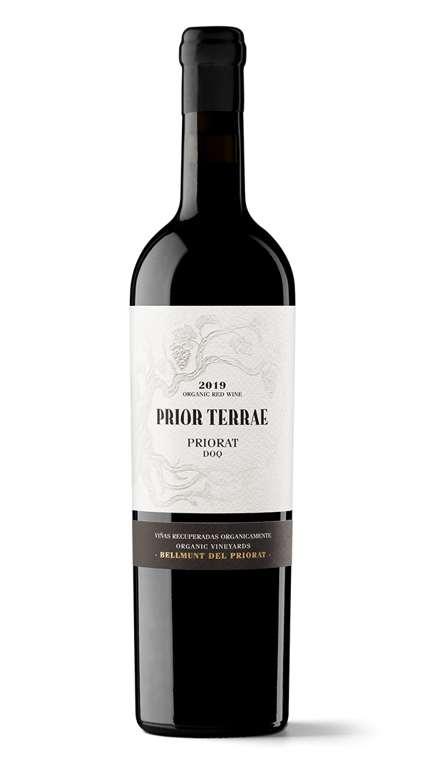
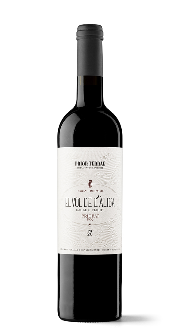
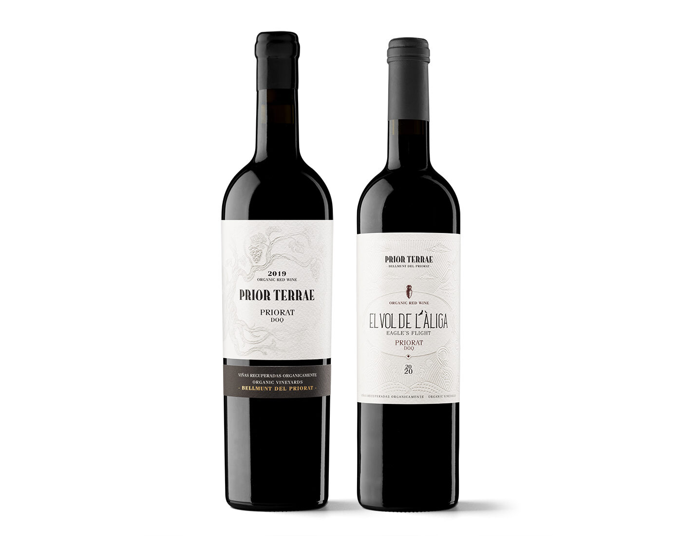
What would a wine label designed by an Escaladei monk look like? Wines were neither bottled nor labelled at the time of this major Carthusian monastery, which was responsible for greatly extending vineyards in the Priorat from the Middle Ages onwards, but Gerard Riu has daringly conducted a truly attractive type of exercise in uchronia to present labels of almost spiritual inspiration. The biodynamic orientation of Prior Terrae, working with the utmost respect for the environment, has played a major role in its design. A way of working that is expressed in the manual, organic and rustically serene tone of this new line of packaging communication.
This work has radically altered the presentation of Prior Terrae wines. Yes, it has. It was basically about reflecting a notion of high-end that had not been perceived before. The client’s main concern was that the wines should ‘breathe’ the seven years of the biodynamic project developed by the oenologist Judit Llop alongside Rovira i Virgili University. Her work has helped to recover the more than 80-year-old vines used to make the first Prior Terrae, later giving its name to the entire project. Several bird species have also been recovered, such as Bonelli’s eagle, which has lent its name to its other wine, El Vol de l’Àliga.
What do these new labels hope to achieve? To explain the project’s complexity and convey the image of a pampered artisanal product of great quality. The image of a winery that looks after every detail, concerned about the land and nature, producing wines of great complexity with humility and proximity. The winery’s own team conveyed these values when they told us about their winegrowing practices and how they interact with their surroundings. And they didn’t want a ‘loud’ presentation at all, but instead something subtle, clean and humble.
Your typographic solution is interesting, a mix of artisanal connotation and vintage style. These typefaces were specifically created for the project. We wanted to enhance a rustic, local tone of handmade work, with its natural imperfections. We also wanted to reflect a certain tradition. The Prior Terrae identity is used as the project’s brand or seal, so we began with an extra bold serif typeface that was retouched to provide more personality, craftsmanship, history and, at the same time, modernity. We chose a typeface that accentuates this ‘modern tradition’ for the other texts.
In the case of Vol de l’Àliga, we created a tall, vertical typeface to avoid splitting the brand in two lines. This solution also provides fresher, more modern connotations, which are perfect for a younger wine.
What is usually the most important thing when considering a new product presentation? Getting to know the winemaker or oenologist and understanding all about his or her concerns and values, how they make wines, where the emphasis is placed. We then start working on conceptualising the brand and label, seeking ways to explain it. At this point, if the scale of the project demands it, we put together our team: designers, illustrators, content creators, copywriters and so on.
What influence does the elaboration have in determining the type of design you propose? How does organic farming in this case translate into communication? We felt it was best to cover the label as little as possible: the less ink, the fewer chemicals. We were also interested in developing clear storytelling so that the seller could explain the reasons for the wines, so that their stories would be easy to remember and replicate.
There is one striking and paradoxically very subtle aspect of both labels: the graphic motif in the background that occupies all the space on the labels. We played with the idea of an unfinished Tree of Life in Prior Terrae specifically because the project itself was still unfinished when the wine came out. The background of Vol de l’Àliga is inspired by ancient stone engravings, medieval parchments, a somewhat esoteric, mythological world. A certain mystical tone came to mind when the winery’s team told us about biodynamics. Their passionate arguments were also filled with developing details.
On a technical level, these illustrations had to be engraved rather than printed. The risk was that they would not be visible enough, but the result was ultimately even better than we had imagined.


