‘We are like miners: we pick and scrape to discover the seam that makes each project unique.’ This is how Gabriel Morales, at the helm of his new studio, Sutil, understands creativity. And this is how he arrived at the beginning of the Novos story. Because these two exciting labels are simply that: the first step towards immersing ourselves in a delightful story of vineyards, winemakers and wines.
Labor de Sol and Tinto de Luna are two beautiful names. What is their story?
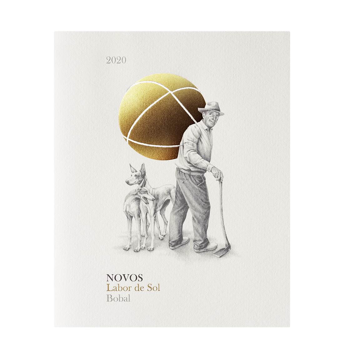
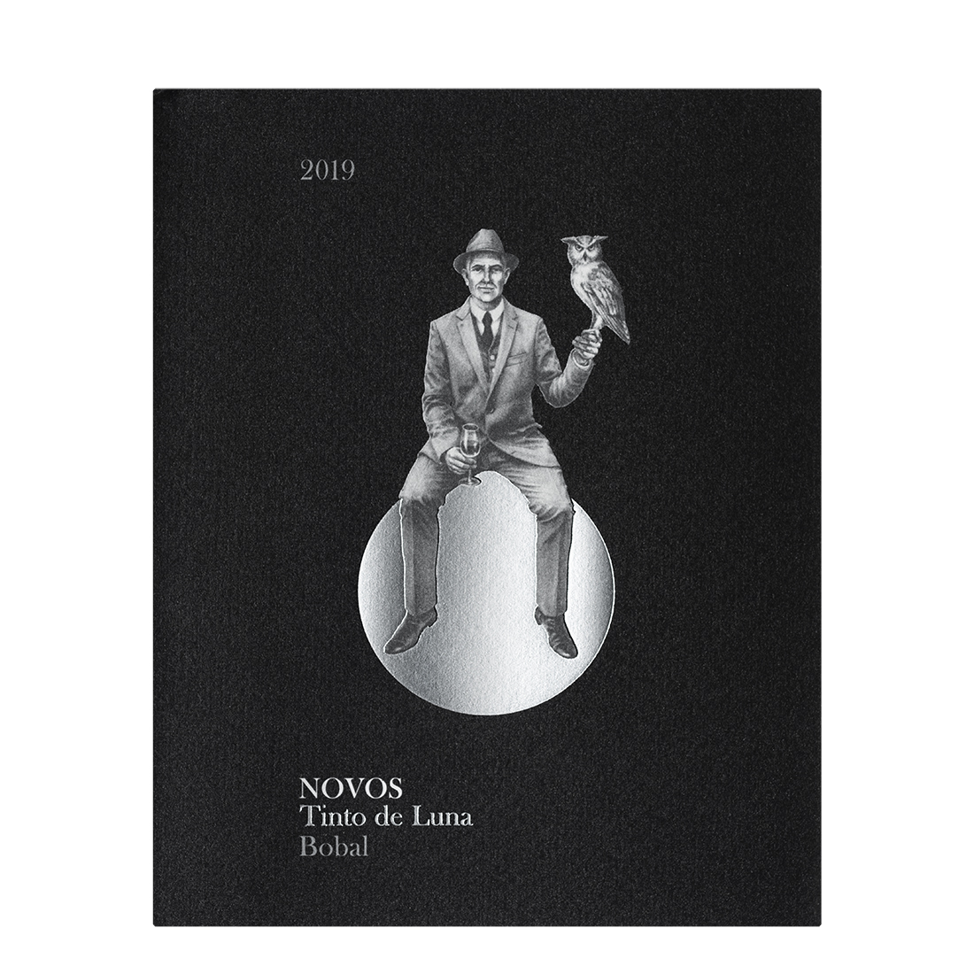
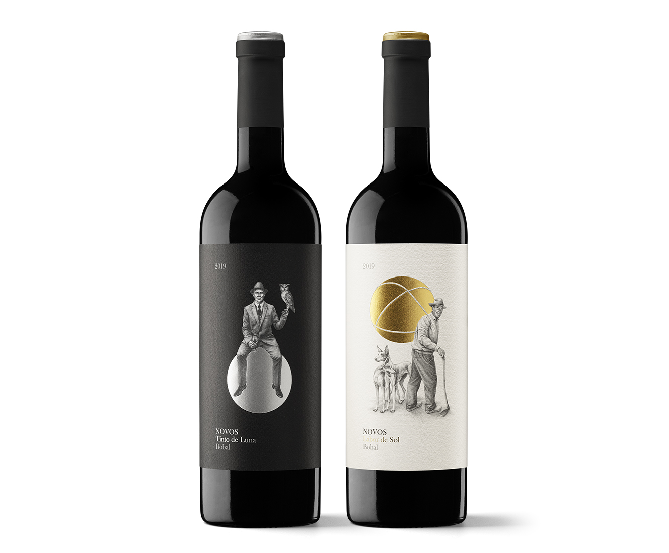
They lead us back to the history of a family of Requena winegrowers, country people who have sweated and worked hard in vineyards over various generations. The current generation of Bodegas Novos wanted to pay tribute to their predecessors, underlining their efforts and sacrifice under the sun, as well as conveying the rest and enjoyment that come at night. Wine unfolds all its evocative power in the moonlight, managing to connect people and even stop time.
From name to image, the labels display unmistakable yet at the same time very evocative scenes.
Yes, they are almost like fairytales. I think we managed to highlight the obvious, a clear legacy that had to be communicated, although adding a suggestive twist, going beyond the literal to create something realistic and magical to make a special image. It is also formally elegant. This as a whole appeals to consumers.
Personification is a creative path that never ends, no matter what visual style you adopt. What does it add?
It is like looking in a mirror. Showing people, talking about people makes us feel identified with the brand or product. Recognising oneself facilitates communication. It is a question of proximity, credibility and warmth. Although there is also a cultural weight that challenges us, which is that portraiture has been a great theme of painting for centuries. And we carry that deep inside us.
It was clear that in this case it had to be the central motif.
Yes, the figure of grandparents appeared as a natural path from the outset of the process. The briefing with the client prepared the ground very well, so once the creativity had been decided, we focused on how to represent this. Deciding on register, tone and style.
Who did the illustrations?
They are the work of Joan Miquel Bennassar, from Alademosca studio. We have achieved a clear, precise representation with poetic content that makes all the difference.
What aspects of the printing would you highlight?
The main technical requirement involved maintaining the register between the various layers and achieving perfect stamping. It is vital to work closely with a printer to find the best solution when dealing with any graphic production process.
This is one of the first jobs of your new studio. How do you define Sutil?
We are a creative design and graphic communication studio specialising in identity and packaging. We understand design as a comprehensive process, from creativity to production control, through which we provide effective solutions by means of visual thought and language. Our work focuses on identifying what makes each client and project unique so that we can enhance it with an identity that adds value, connects it emotionally with its audience and makes it unforgettable.
What is the current climate of wine packaging design? What are clients looking for? What new avenues are opening up?
The overall goal is always to sell, although some clients are concerned about something else. I seem to detect more honesty at the moment, an attempt to discover what makes a wine or a project unique. To create something more real and more transparent. There is a certain search for balance after the era of ‘shouting on the shelf’. Perhaps clients before were less aware of the need for narrative, famous storytelling, which is now on the rise. There is a lot of demand for aligning the label with narrative: ‘I need an explanatory discourse’. Then there is a bit of everything in terms of visual language: the skin that adapts to each project.
What would building the Novos brand narrative therefore be like?
The aim is to maintain the same register if communication is developed. So that it is like a skein, so that the market can pull the thread. This is what the project requires for an overall view and consistency. I believe it will all arrive in time, because there is a willingness and there is a discourse.


