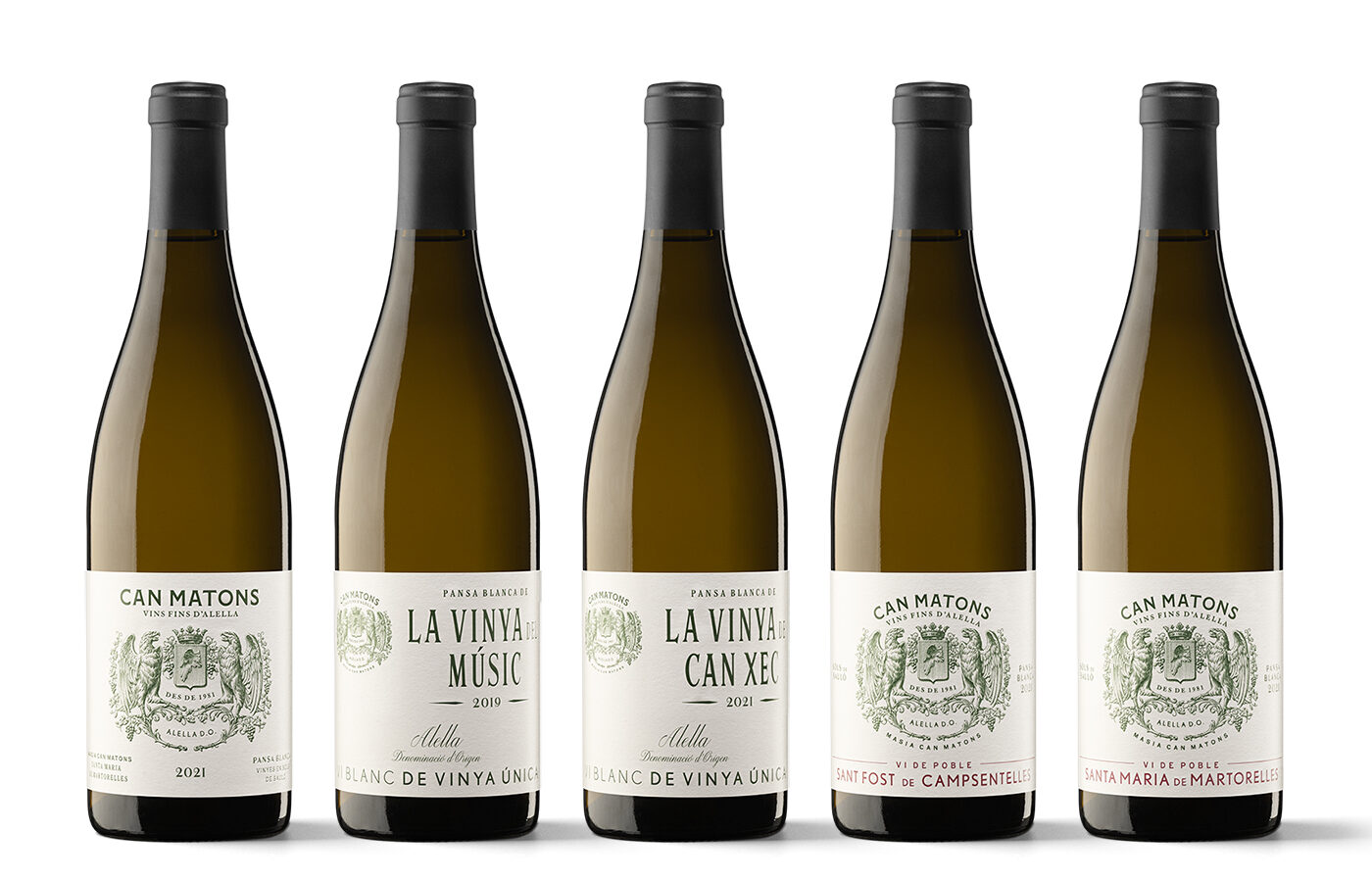
Miquel Capo, graphic designer and partner of the Xavier Bas Disseny studio, dissects the Can Matons case, one of the most attractive Catalan wine branding and packaging projects of recent years. The details of this job reveal a well-articulated conceptual, creative and graphic philosophy. In addition to several solid ideas, such as viewing typography as the perfume of a project or taking advantage of the design of a wine as a way of delving into an exciting world.
The process exudes knowledge, personality and consistency, displaying a visible result: a family of labels that, apart from style, convey soundness and a vocation for permanence. Like a vineyard that is looked after for future generations.
Can Matons is a new brand. What are the challenges of starting from scratch, and what are the incentives for a designer?
I would say that ‘starting from scratch’ is a false myth. At the very least, there has to be a client and a commission to carry out a project – if we are referring to professional projects. And a little or a lot is already information. From there, defining the type of project that it is, its target audience and what the client’s expectations are; these are guidelines to carve out a path. It is always interesting to let yourself go a little and not know where you are heading, at least for a while, before wanting to lead the project to its final result. As for the challenges, a very important one is to calculate the timescale properly; in other words, to decide how much time you can ‘saunter’ and how much time you should dedicate to being decisive and shaping ideas.
The incentive, at least for me, is always to understand the design object better, to learn something or to meet someone interesting. And walking through vineyards – however much it may seem that if you have seen a few, you have seen them all – is always a source of joy and surprises.
The Can Matons winemaking project is part of a Burgundian approach, which implies a specific product range order. What are the implications of this for the packaging design?
The approach is indeed Burgundian, that is to say, territorial. Three wines that are differentiated by grape origin – from any area of the DO, from a municipality or from a specific estate, respectively. It is therefore crucial to explain this characteristic properly. It is also necessary to express unity and difference, although this may sound like an oxymoron. On the one hand, all the wines have to look similar enough for consumers to identify that they belong to the same range or winery, and on the other hand, we have to help convey the value of each wine, making them visually different. The higher the price, the more special and greater personality the image of the wine can have, which is a way of suggesting that what is inside the bottle is equally special and has personality. I would say that in this specific case in question, working with a small winery from a small DO helps us to go one step further from the usual codes of the wine world, despite having a classically grounded visual appearance.
How was the idea developed and how is it being implemented?
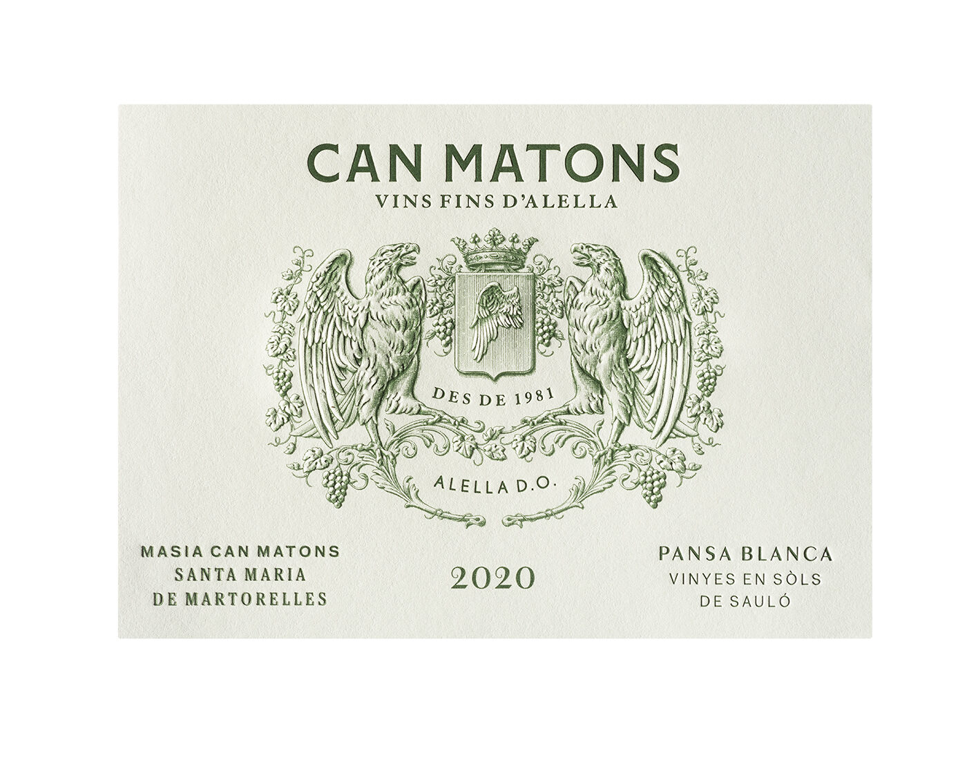
These wines are made at Masia Can Matons, which was once owned by the Marquis of Alella. The Marqués de Alella brand was produced at this estate with the creation of the DO Alella in the early 1980s. Its presentation used the coat of arms of the Marquisate, which at the same time included the coat of arms of the municipality of Alella – a winged coat of arms – on its labels. When we went to taste the wines and learn more about the project, it seemed like a good starting point to take specific elements from the old labels. It was somehow a return to the project’s origins.
In terms of implementation, there is a desire for moderation to stress the product’s value without any unnecessary additions (I am thinking, for example, of the use of prints). A type of back to the roots with simple labels: a coat of arms, a colour and typographic information all resulting in a solid, valuable, classic image with a distinct personality.
The combination of sans serif and vintage fonts is visually striking. What typefaces are they?
Can Matons – the brand – uses a typeface that we created in the studio and named Matona. It was made specifically for this project, with the indispensable contribution of Mercè Núñez, the studio’s designer. The numbers were also custom-made for this project.
I have been passionate about combining typefaces ever since I was a student. One of my teachers, Pablo Martín, used to say that typography was the perfume given to projects; I could not agree more. Properly. Properly combining essences to lead to a harmonious result is something that obsesses me and to which we dedicate many hours.
Why just one colour?
It is the historical colour of the Marqués de Alella brand, and it worked well for us in order to unify the appearance of the three wines, as well as to give them their own graphic character.
Is heraldry returning, or has it always been here?
Heraldry is archetypal; it will always be present. The question is that if it is not based on reality – in other words, if it is created deliberately – it ages badly; it is seen as something false. Returning to the idea of perfume, I would say that it is a very strong essence requiring a very generous dosage. Otherwise, there is a danger of trivialising the labels or becoming something very stale.
They seem to be very simple labels in terms of production.
They are, although there is a twofold use of reliefs, embossing and debossing, which have been outlined to enhance the illustration and classic look of the design.
How is the brand performing commercially?
The news we have is extremely positive. It has been very well received. In fact, they ran out of wine much earlier than they thought in the first vintage. There are plans to expand the range with a line of sparkling wines, Titiana de Can Matons, which will take advantage of the strength acquired by the brand.
What must a commission in the wine sector have to be particularly motivating for you?
I like any project that allows me to extend my knowledge of the sector, which goes far beyond purely professional interests.
I would say there are two key factors to be especially motivating: the people involved and the quality of the wines. It is much easier to connect if there is a love for the work, and this emotion can be conveyed by the brands to their products.
Does this tie in with your tastes as a consumer? Are you personally one of those who are passionate about the wines you design to the point of incorporating them into your ‘bottom of the cabinet’ wine consumption?
If we take into account that our studio has been working with large producers, small and medium-sized wineries and large groups for 25 years, there is a broad range of possibilities. But as a consumer, and I define myself as a wine drinker, I don’t stick at all to what we have designed here in the studio. The world of wine is even broader and interesting things are happening everywhere. This doesn’t mean that sometimes I am not particularly excited to take home a bottle designed in the studio. Or to experience it as a very pleasant surprise when someone orders or brings a wine with an image of ours on it.


