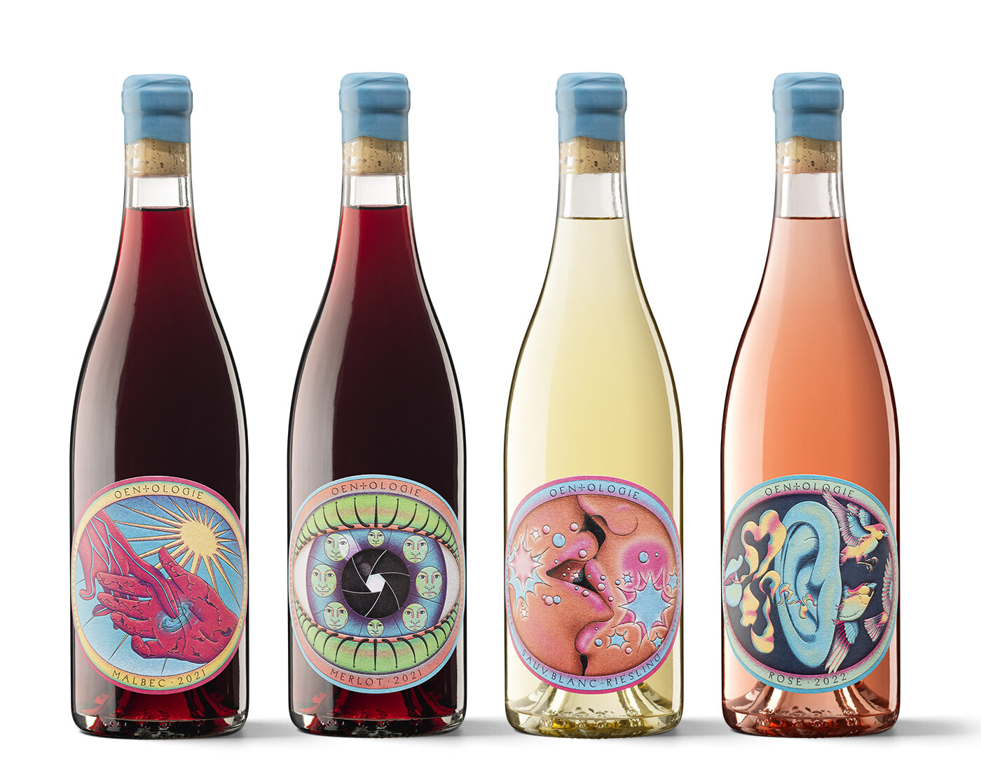
Now that truly is teleworking, although distances or limits don’t exist when energy and thought are flowing. The Australian winegrower and oenologist Gavin McBurney has once again entrusted the Barcelona studio JJ Bertran with the design of his second collection of wines, with the open motto of dealing with human relationships. The solution is conceptually clear and graphically powerful, presenting us with wines that could be the official drink of a 21st-century Woodstock.
This project has a strange, marginal and enigmatic air about it. Starting with the name.
Oentologie is the sum of oenology and ontology, that is to say, knowledge. Oentologie has many overlapping layers, many references, and it is heavily charged with thought and reflection. That is how its creator is like, a self-made man with many influences from the countercultural movements of the 1960s and 1970s.
This is the second series of labels you have designed for him.
Yes. It is a sequel aimed at his range of easier wines, with higher production and for a less demanding market segment. Perhaps more commercial, although without departing from the indie character of all Oentologie’s production.
What is the difference visually between the two series?
The first series was more pictorial and conceptually more complex. More symbolic and more interpretable. The second is crazier and weirder from the outset. But both ranges share a similar expressive framework.
Does all this respond to the client’s initial brief?
Gavin McBurney had no idea of how to approach this sequel, beyond a general air of philosophy, spirituality and humanism. The brief was very open, but it was based on a clear message.
What was to be communicated?
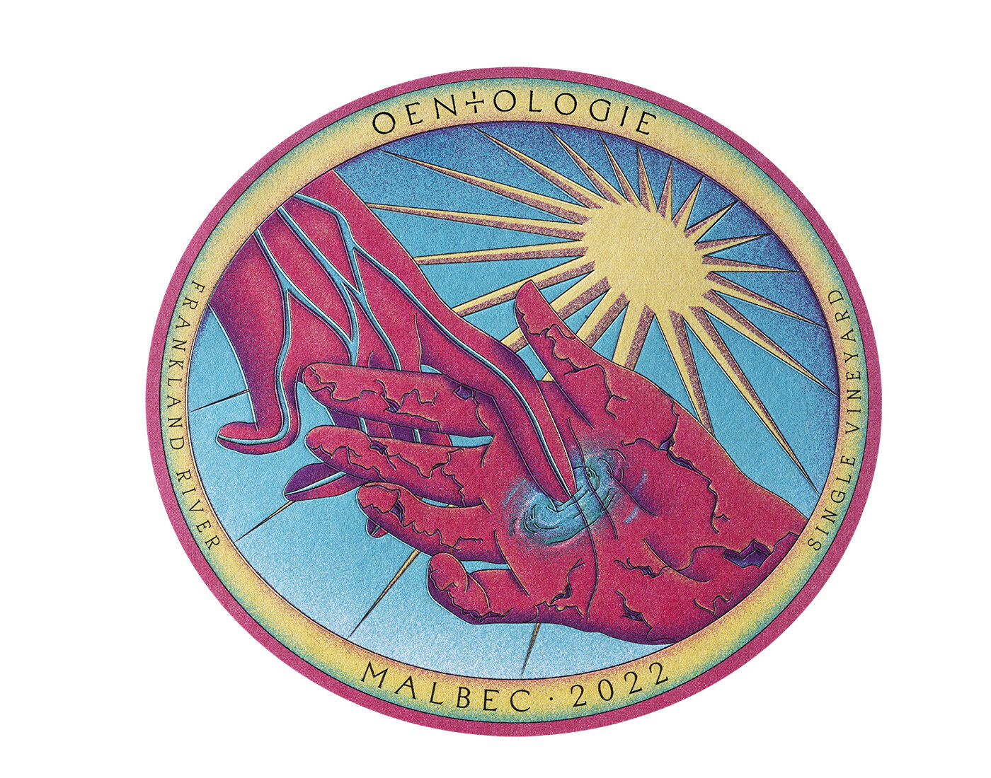
A basic human need: the connection between people. We decided to convey this relationship through an illustrated representation of the senses. But more than organs or actions, we discussed emotions. Emotions and energies through the senses, creating a dialogue and transformation between human beings. Because the play of senses gives life. We wanted these concepts and images to exude positivity and optimism.
The result recalls illustrations from the 1970s.
We wanted to link the spirit of the hippy era with a contemporary look. We reinterpreted very intellectual thought with a mixture of mysticism, learning and self-knowledge. The creative art direction process was extremely organic. We were researching, thinking and at the same time creating the illustrations, which are the work of María (Oldecop). Gavin himself related the change in the labels to a kind of DNA chain that was being recreated.
Beyond these connotations, how do you assess the commercial aspect of the series?
These labels are attractive, more digestible or ‘empathetic’ than the first ones, which had a greater intellectual component. These are more direct. And they are easier to recognise: for many people they are ‘the label of the eye’, ‘the wine of the kiss’ and so on.
Do they have a back label?
Yes, this is a very important piece for us, because it offers an additional opportunity to generate a message. The back label of Oentologie is a triangle that contrasts with the oval front; its content clarifies, underpins and amplifies the balancing act of the entire proposal.
What is it like to work for such an ‘extreme’ type of producer or winery?
We always try to work with the utmost freedom, although always within the communication needs of the client. We are not mistaken: we are not artists and we don’t go overboard. Taking certain graphic risks does not mean ‘just doing things for the sake of it’. We are very serious. We try to imagine languages beyond that of common codes to position the client whenever necessary. And we do the same thing when we have to provide design services to clients working from the most limited marketing. We adapt. The message is the client’s message, and we simply filter it through our interpretation.


