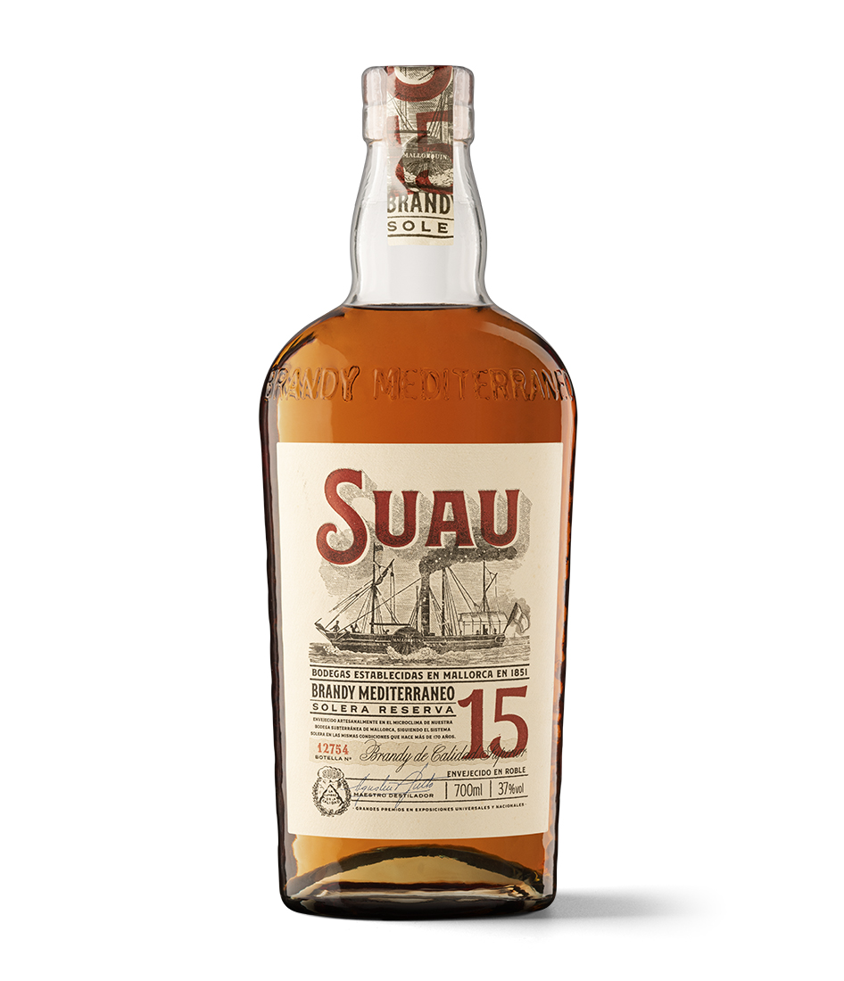
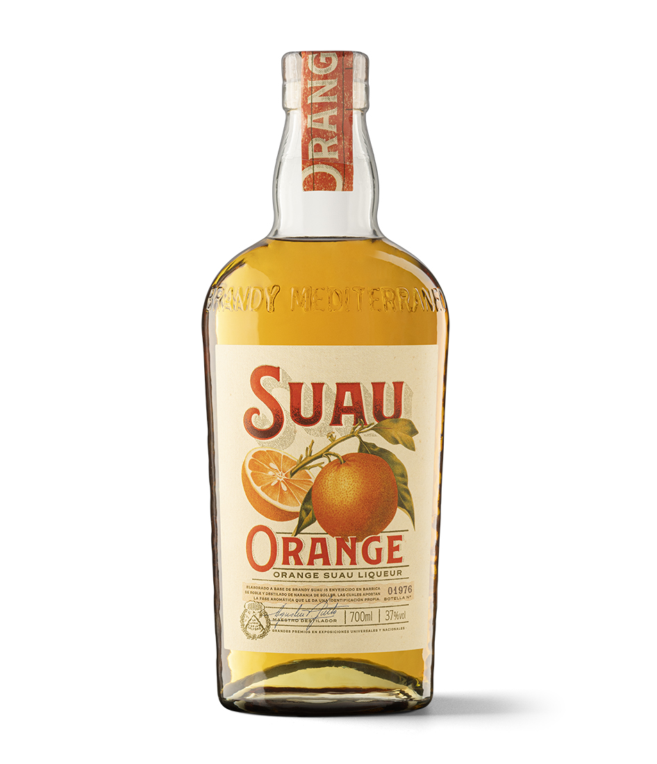
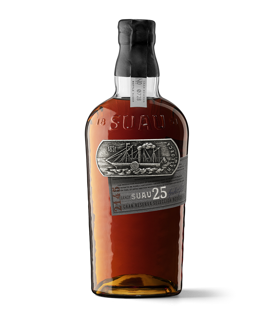
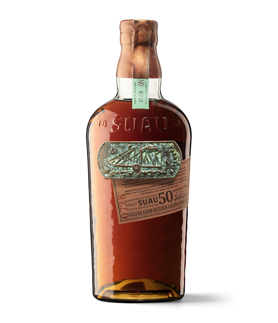
Maritime trade with the West Indies reached its peak in the 19th century and one of the most prominent captains was Mallorca’s Juan Suau, who went on to set up a distillery in Cuba. With the passing of the years, and the love of a fellow countrywoman in the meantime, he returned to his native isle and there started from scratch with another distillery business, the predecessor of today’s Bodegas Suau. After several generations and many ups and downs, the house began to produce brandy with its own casks. Today, it is the only brandy produced in the Mediterranean. Its bottle and label, both created by Series Nemo, are imbued with the fascinating atmosphere of overseas voyages, as part of a suggestive tribute to an intrepid navigator between two islands.
What is Suau and what is Suau 15? Suau is a brandy label that makes its products on the island of Mallorca. Its founder was a merchant seaman who traded spirits with Cuba before deciding to leave the world of ships and plant roots on land for the love of his future wife.
It is a promising enough story so far, but when you learn about the product’s origins and how it is made with love and craftsmanship, you cannot help but fall in love with Suau brandy. Suau 15 years is the least aged, but this doesn’t stop it from living up to expectations. It is the first step in a series of 25- and 50-year-old products that make up the excellent range of this unique brandy, born in the middle of the Mediterranean.
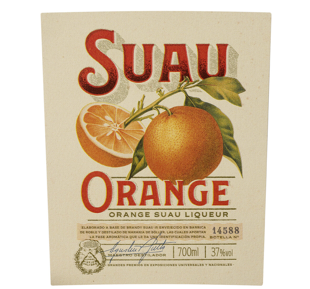
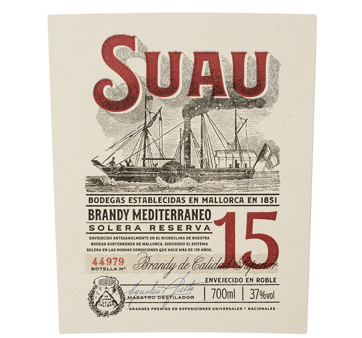
What was the aim of Suau’s label design? It was always to emphasise the true quality of the brand based on its main products: Suau 15, 25 and 50. This required a major change with regard to the existing product and to consider reviewing all areas without leaving behind its uniqueness, identity and historical background.
Apart from its tangible characteristics, what are the product’s values and what should the new packaging convey? It is the only brandy produced on a Mediterranean island, which means that its production method is conditioned by barrel maintenance, so it is therefore a little different from the brandies made on the mainland. This peculiarity gives the product a special uniqueness. The artisanal nature of the production process has also been transferred to the labelling and finishing processes.
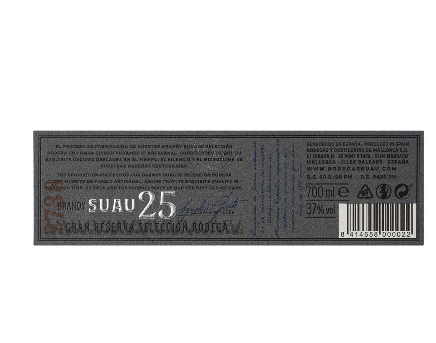
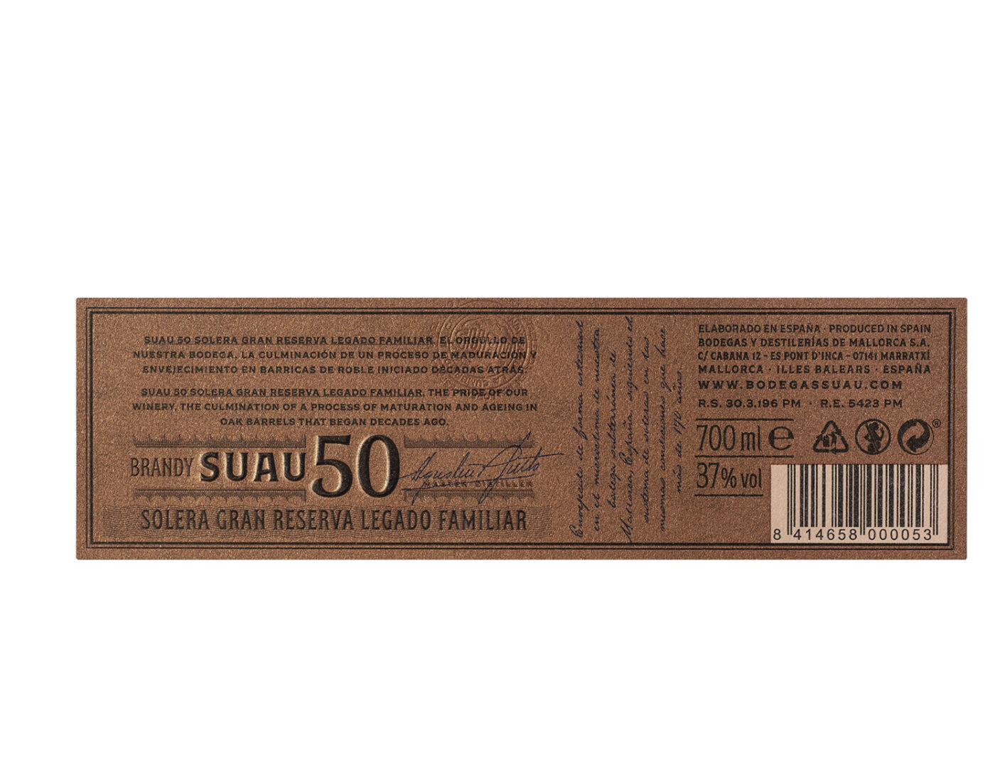
Its overall aesthetics are striking, harking back to a colonial trading past. What is the genesis of this visual aspect? What do you base it on or draw inspiration from? Captain Suau was a merchant seaman who traded with Cuba. We liked the idea of using the inspiration of vintage shipping posters for the labels of the younger brandies. The older ones – 25 and 50 – have a metal plate reproduction of the wooden item that was used for the first barrels, some of which are still preserved today. The inspiration for all the graphics are the elements and resources used at the time of the winery’s foundation.
How do you develop the actual bottle? We wanted to make a contemporary version of the bottles used at Suau during its origins. The use of texture and recycled glass adds a historical value and geographical narrative to the bottle. Its oval shape (a bit like a flask) provided us with a large surface area for texture and labels, as well as clearly delineating the two sides. This is important because both sides of the bottle are the front depending on the product. Then there are other details that make this harking back to the past credible and these are associated with our knowledge of the history of glass.
The bottle also unifies four products with a single model, thereby simplifying logistics and processes. This is not merely an exercise in economy of scale, because it has helped to increase product and brand perception compared to what was previously available.
Typography and illustration are the two main graphic elements in the label, and they represent a giant leap compared to the old presentation. What was the creative process like? It wasn’t very different from the other projects we have done. It is very important for us to have a methodology and be strict in the process. We have to exceed the expectations of our clients in every project because we specialise in the wine and spirits sector. This would be impossible without a method. Although it is true that the client expressed his enthusiasm from the outset of this project and gave us a tour of his cellars and a number of experiences revolving around his brandy, which undoubtedly gave us added inspiration and motivation.
Do you think about its longevity and posterity when designing a product of this kind? All products have to be reviewed over the years. We have clients for whom we have reviewed the same product several times over the years. The motivation for this can be diverse: competition, market, strategy, logistics, optimisation and so on. It is not always design-driven motivation, even if design is then used to resolve the need for an upgrade. It is always very important for us that the products we design are contemporary and can be dated in time. This helps us to add value to brands and build on what has already been stated. Our obsession is that our products don’t look like fakes.

