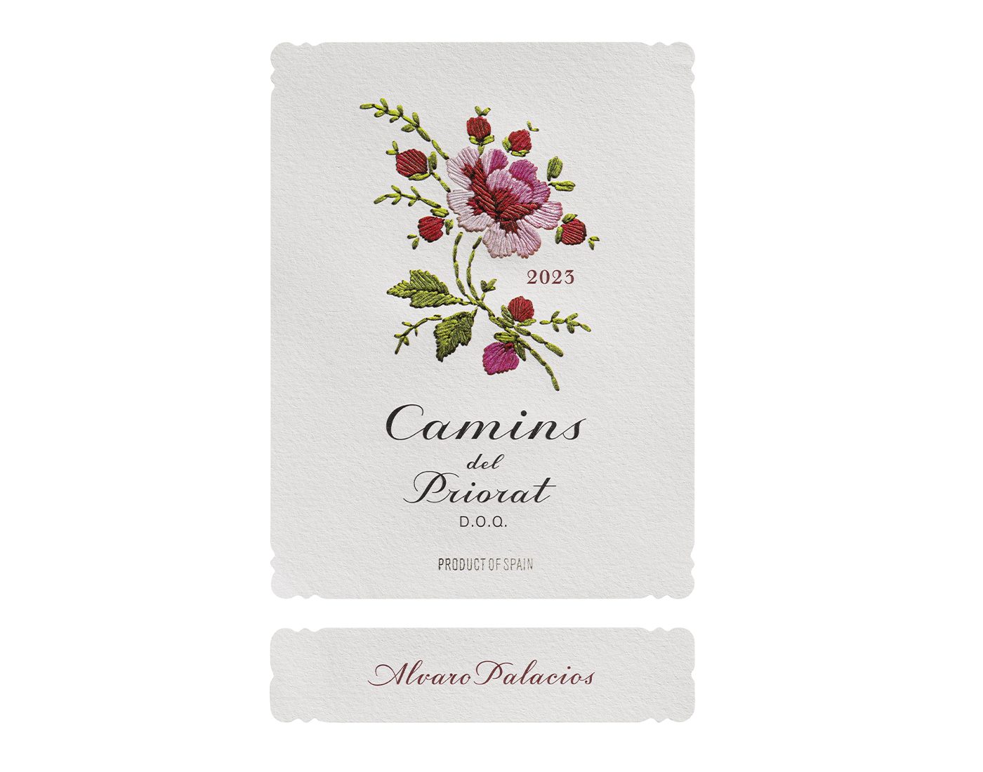
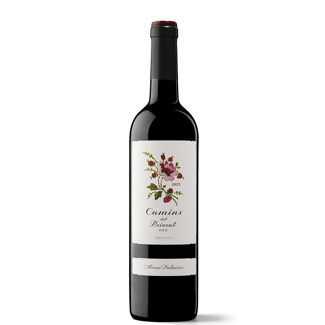
Who has not seen the Camins label? Its illustration is undoubtedly one of the most recognisable and recognised motifs in the wine market. A motif that brings together the best virtues of vintage imagery, among which include its opportunity to be radically contemporary. For Xavier Bas, it is also an interconnected story of discoveries that paved the way for opportunities and recognition for him. The most important thing: the realisation that he was on the right path as a designer specialising in wine packaging.
Why does the Camins image work so well? It’s a true objet trouvé that offers open, suggestive readings. One of them allows us to discuss terroir in the broad sense that it has in the wine-growing world: the sum of the geophysical, agroclimatic as well as human and cultural factors that converge to give a wine its character. What is the Camins rose if not an evocative, figurative and sophisticated message of the virtues of this wine’s original environment?
How was it received? There’s an anecdote about Xavier that illustrates this perfectly. He was at a calçotada when someone arrived with a case of six bottles of Camins. After a while, Xavier asked him why he had brought that particular wine. ‘Quite simply,’ he replied, ‘because it’s a good winery, and I thought that, with such a pretty label, the wine would be good.’
Revealing! Yes, this short story shows the label’s achievement as an image per se, but above all as a trigger for a process of trust and empathy. The image of Camins connects the brand with the consumer. The latter – personified here in that guest who one day appeared at a calçotada with six bottles shortly after the product’s launch – feels a bond with the winery, the vineyard and the story.
What’s it like to work with wineries and producers with a very striking territorial identity, as is the case with Álvaro Palacios? It goes hand in hand with an exciting, truly interesting dimension: getting to know the territory first-hand and interpreting its geographical, visual and cultural keys. All this information and experience is highly beneficial for brand building. For the studio, it also means consolidating a unique perception of how to communicate wine, almost vineyard by vineyard, region by region.


