- Techniques
- 3D Embossing
- Spot colour Offset
- Stamping
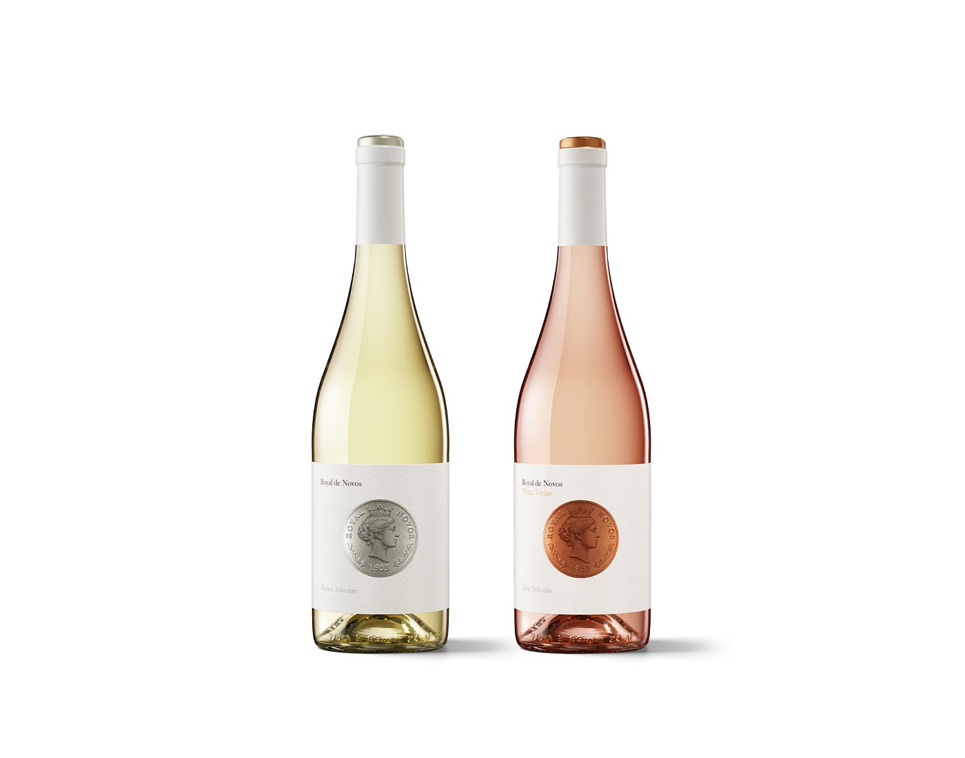
With Royal de Novos, Gabriel Morales has achieved a small squaring of the circle: standing out while remaining consistent with the rest of the Novos range, which we discuss here. The result is a couple of labels – rosé and white wine – very pure, very classic and very contemporary. This is not a contradiction, because Royal de Novos has everything it needs to succeed.
Tell us about the story of this label. What did the client request? Royal de Novos originally began as a packaging project for a Provençal-style, royal variety rosé wine, to which a white wine was later added, turning the commission into a line of two wines.
The brief for the graphic image was for an elegant, attractive and high value identity that would also be consistent with the conceptual and graphic universe created some time ago for Labor de Sol and Tinto de Luna, the first two wines from Bodegas Novos.
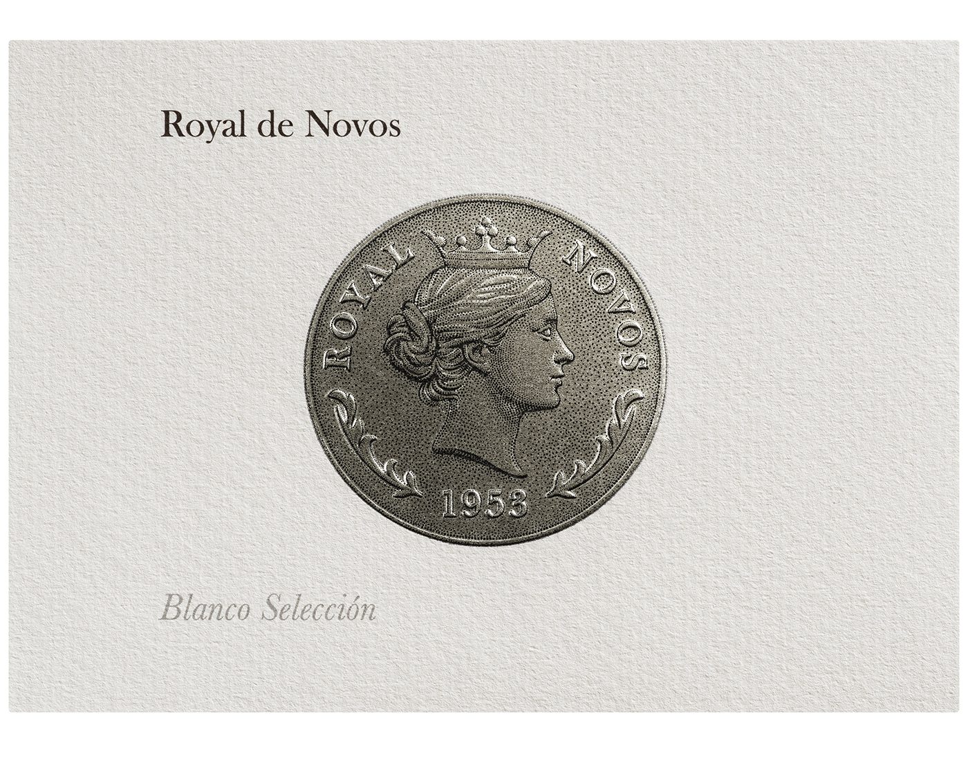
The coin emerged as the idea that best reflected this concept of ‘high value’. An element that clearly connects with this quality, whose shape would enable me to consolidate the graphic identity of all Bodegas Novos’ wines through a single graphic element: the circle.
Who is the crowned lady depicted on the coin? She represents the mother of Sergio Ramos, the winery’s current manager. Selecting her answered two important questions regarding the project’s creative development. On the one hand, she was the ideal figure to pay homage to (just as the grandparents were with the Labor de Sol and Tinto de Luna wines) and, on the other hand, she was the perfect candidate to be transformed into a queen worthy of being depicted on a coin.
What dialogue do the Royal de Novos labels engage in with the rest of the Novos range? It was clear to me from the outset that these wines should have their own universe, although it was also necessary to find connecting links with the winery’s two other wines. On the one hand, family history is once again present through the figure of the mother and, on the other hand, the link is also present in the graphic structure in the shape of the circle. The sun, the moon and now the coin. It’s a subtle, tenuous and yet powerful thread.
What did you aim to achieve in terms of messaging? The main thing was to create an honest identity that responded to what the client requested in his brief and that aligned with the winery’s values. A name like Royal de Novos, designed ad hoc for the commission, evokes a coin depicting a royal figure on a simple, white label accompanied by just a few words. Very few elements that say and convey a lot. There’s nothing else, because there doesn’t need to be.
The historicist roots are striking: the use of numismatics and medallions hark back to the common language of the few wines that were bottled more than a century ago. How do you view the return to historical graphics as a creative path? The classic world is familiar territory and revisiting it is always a delight. It’s a universe that adds credibility, although resorting to it runs the risk of the product becoming just another one of many. The key for me is to use it only when it makes sense, while also finding a way to do it that has a unique result.
Who did the illustration of the lady on the coin? It’s the work of Alex Ferreiro. I knew the coin had to look realistic, but I didn’t want to use photography or 3D. I wanted it to feel natural, and illustration could provide that for me, so I contacted Alex, and he was immediately drawn to the project. In terms of style, we considered several options and finally settled on pointillism, which means that the circle ends up also being present in the way the motif is represented. It’s a small detail that contributes to the overall concept.
What technical resources are used on Royal de Novos labels? Offset printing, stamping and letterpress multi-relief on the coin to give it more protagonism. The latter is a key finish on the label as a whole, as it provides different levels in the coin’s relief, adding greater richness and depth to areas such as the figure’s hair, for example. It also stands up very well to subsequent labelling because it doesn’t lose any height, making it more noticeable than conventional relief.
How important are narrative and storytelling to you? I find it hard to construct something without a story behind it. And if there isn’t one, it has to be created. It’s the soul of a project. History is present at Royal de Novos thanks to the female figure. This stems from the question of who the woman portrayed on the coin is. It pays homage to the winery’s identity, what it is, its origins.
What has the Novos project brought you as a designer? It’s a project of which I’m incredibly proud. In fact, I could say that I’m enamoured of it. Feeling the winery’s trust in my work and being able to support them over the years in the process of searching for their own language is a challenge that I find extremely rewarding.


