- Client
- Bodegas Toro Albalá
- Techniques
- Debossing
- Embossing
- Spot colour Offset
- Stamping
Carles Anadón is attracted to challenges. A fervent believer in innovation, strategy and sophistication, he set up his own packaging design studio, Likit, with the idea of adding a unique touch to global projects, from the label to the volume, while enjoying the creative process and engaging with clients. He is committed to opening up, both literally – internationalisation awaits – and figuratively, by extending all the knowledge accumulated over a 30-year career. Let us begin with a recent small project for a brand in Bierzo called Imalia.
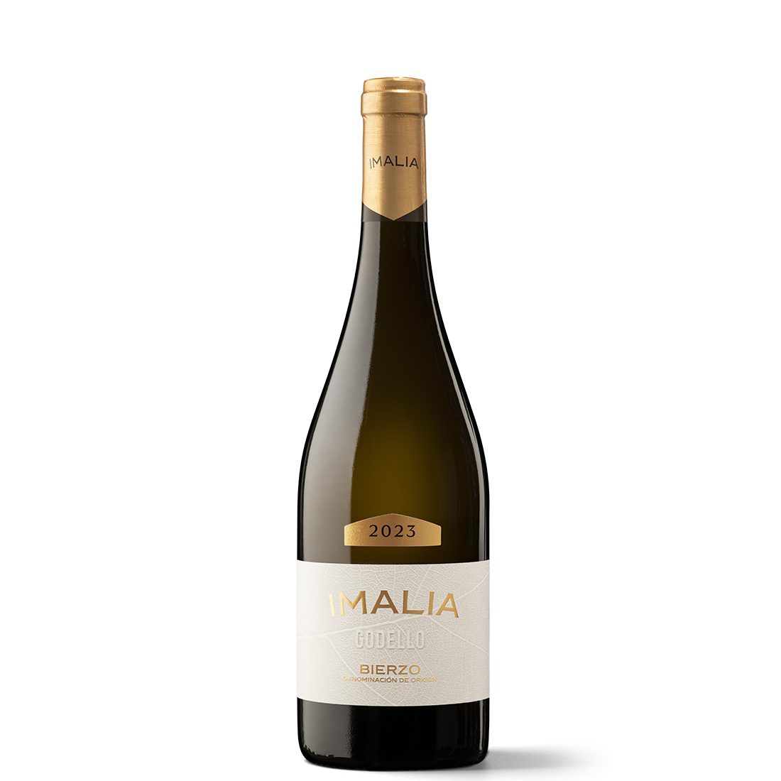
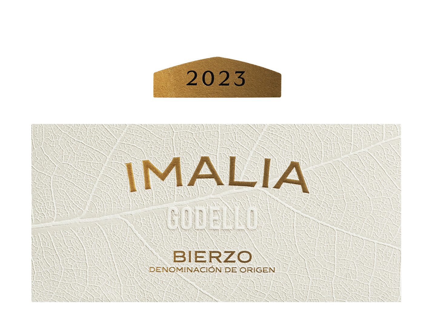
Imalia’s label is pure visual impact. Tell us about its story. It responded to the launch of a new brand, so it needed that initial impact. It’s a wine produced in Bierzo by Toro Albalá, Montilla Moriles’ winery. The label combines the name of the brand and variety as well as an illustrated motif underneath that represents the texture of a vine leaf. This sum of components harmonises an intense presence of the name and the territorial identity as conveyed by the aforementioned vine leaf, which is made by stamping or bas-relief.
The curve outlining the name Imalia is striking. Yes, it’s in the shape of a bridge or arch, which gives it a distinctive personality. As I said, we needed a design that would stand out immediately.
What else is notable about the Imalia project? The capsule, which is the result of an innovative technical development. Visually, it appears with a striking peak, like a cigar band, a solution that adds character. Technically, the serial production of capsules with bases that are not straight is very complicated, so I created a visual simulation with part of the capsule tinted the same colour as the glass of the bottle. This ‘trick’ works especially well on black or very dark bottles.
What does this sum of formal and tactile elements contribute? A necessary sensoriality to provide sophistication and attraction. The design and proper application of printing techniques are messages for consumers: if the label is well crafted, the contents must surely match. It’s a way of reaffirming the promise that you’ll find inside the bottle.
Why is packaging design important? For reasons of sensitivity and emotion. When the bottle is dressed with an emotional trait, a touch, an attractive story, the product has the ability to connect more with its audience.
You set up Likit in 2024. What is your focus? Firstly, to provide a high level of specialisation in both graphic and industrial design. Although I come from a graphic background, I’ve been managing global projects for years and have also learned a lot from the object side of things. As for the sector, I would like to contribute to its strength and solidity. So that clients don’t think of going to London to find a design studio, but, on the contrary, that wineries from all over the world come to Spain to work with local designers, who are as good as those in London, but cost half the price.
What do we lack? It’s a cliché, but we lack the knowledge of how to sell better. Not only design, but also strategic thinking, which is what increases the value of our creative work. We spend all day monitoring the wine and beverage industry, observing what is and isn’t being done, seeing what is lacking… We have a lot of information and should know how to leverage it for the benefit of the project, turning it into a strategy and thereby achieving an increase in our fees. We would work better; the client would be happier, and so we would all be happier.
What makes a product work? It depends on the client’s objectives, but thinking outside the box is always valuable. When I come up with a distinctive element that no one else has, I’m very pushy until I get the client to accept it. I know that sooner or later it will work.
Are you inspired by any visual references? I know what’s happening in the market, but I don’t focus too much on it. I’ve always told my collaborators to avoid looking at images of bottles because they won’t be able to resist doing something similar, but they hire us to do something different. It’s better to look at – I don’t know – a fashion website or a film with an interesting aesthetic.
Why the name Likit? I chose the name Likit so that people wouldn’t doubt what I do. Also because I have a fluid, easy-going and flexible personality. And I like to be open in terms of sharing my knowledge with the community of designers who are dedicated to or want to dedicate themselves to packaging. So that the sector as a whole thrives, there’s no point in keeping secrets. Besides, don’t be afraid of your competitors: they’re your colleagues, and there’s work for everyone!


